Information Design - Project 1: Instructable Infographics Poster

Ting Wen Yi / 0361799
Information Design/Bachelor of Design (Hons) in Creative Media
Project 1: Instructable Infographics Poster
INSTRUCTIONS
An infographic poster for ONE recipe selected from Pasta Grannies. Study one video, break down, and chunk the preparation and cooking process into an instructable poster. Try to capture each Grandma’s personality and unique dish identity in your poster as part of the narrative structure.
These infographics present complex information quickly and clearly, with symbols charts, and diagrams. With an information graphic, computer scientists, mathematicians, and statisticians develop and communicate concepts using a single symbol to process information.
Your job is to transmit a set of instructions and at the same time educate the audience. Infographics should be fun, it should simplify the context while representing information graphically.
Because “A picture is worth a thousand words”. Yours should reflect the following:
- To transmit or communicate a message.
- To present large amounts of information in a compact and easy-to-understand way.
- To reveal the data. Discovering cause-effect relations, knowing what’s happening.
- To periodically monitor the evolution of certain parameters.
You will develop an infographic to communicate a concept, topic, or idea - IN THIS CASE A COMPLETE SET INSTRUCTION TO A RECIPE.
The infographic should take viewers visually through the information you want them to learn or know. Based on your infographic the audience should be able to learn through viewing and interpreting the various graphical information and text.
You will be required to evaluate what parts of the topic, concept, or idea are most important to tell/demonstrate and ask how you would represent each piece of information best. You will also decide how to graphically represent the most salient facts about your topic, concept, or idea for student learning. This includes the finishing outcome which could be a slick animation or even a rough stop motion.
Theoretical (Information Design Framework)
- Information type
- Device
- Principles (LATCH etc)
- Aesthetics i.e: isometric, simplified illustrations
Requirement: You will need to reflect the following (assessment criteria):
Practical - photo editing/illustration software
- Graphs, charts, and diagrams
- Poster size: 1240 × 1750 pixels or 2048 × 2048 pixels
PROJECT 1 : INSTRUCTABLE INFOGRAPHICS POSTER
1. Chosen Video from Pasta Grannies
Figure 1.1 Giulia's Cappelletti from Pasta Grannies - Week 3 (20/2/2024)
I have selected cappelletti to feature in my infographic poster. After watching the video, I noted down the ingredients used and the process for making them. Also, grandma Giulia possesses a lively character and operates her own chicken farm. I aim to capture some of her vibrant personality in my poster design.
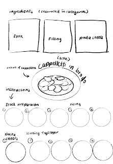
 |
| Figure 1.2 Ingredients and Instructions Extracted - Week 3 (20/2/2024) |
After writing down the steps in my notes, I reorganized them and categorized them into pasta sheets, stocks, and filling. I used Miroboard to jot down the notes.
 |
| Figure 1.3 Simplified Instructions - Week 3 (20/2/2024) |
The cooking instructions extracted from the video are quite lengthy. To make them more suitable for an infographic poster, I have simplified and condensed the steps.
2. Mood Board
 |
| Figure 2.1 Moodboard - Week 3 (20/2/2024) |
I've created a mood board to visualize my initial idea after watching the video. It features a colorful, pastel palette, with emphasis on colors such as yellow to represent ingredients like eggs and flour, as well as the end product of cappelletti. I've avoided using blue, as it may not stimulate appetite. For fonts, I've selected playful options like Recipe Daily, Food Creamy, and Crater for titles. I've also included images that showcase the visual style I envision for my assets and food pictures – a vector style with minimal and simplistic illustrations. Lastly, I've added layout examples for reference in designing the poster.
3. Visual Reference
 |
| Figure 3.1 Visual Reference 1 - Week 3 (20/2/2024) |
This poster is highly informative, as it not only showcases the process of making kimchi but also presents the various types of kimchi and their effects. I particularly appreciate the graphic design of the poster, with its simple yet slightly realistic illustration style.
 |
| Figure 3.2 Visual Reference 2 - Week 3 (20/2/2024) |
I like how this poster separates the ingredients and cooking methods, placing one on each side, while the middle showcases an axonometric view of the layers of tiramisu. This view clearly illustrates the composition of each layer.
 |
| Figure 3.3 Visual Reference 3 - Week 3 (20/2/2024) |
This infographic has a very straightforward layout. The ingredients are separated at the top, followed by the instructions at the bottom. They are also distinguished by contrasting colors, with purple for the ingredients and yellow for the instructions.
 |
| Figure 3.4 Visual Reference 4 - Week 3 (20/2/2024) |
This poster adds playful subtitles in each step of the instructions, such as "jazz it up," adding a fun element to the process. It also includes pull-out information sections for different food items. The ingredients are neatly organized into categories like base, seasoning, and toppings for clarity. Moreover, it uses a red background to complement the "tomyum" theme.
4. Sketching/Drafting
 |
| Figure 4.1 Sketch 1- Week 3 (21/2/2024) |
For my first sketch, I organize the data by separating the ingredients into stock, filling, and pasta sheet. This is followed by a picture of cappelletti, then proceeding to the preparation of stock, filling, and pasta sheet, all organized step by step.
 | |
|
For my second sketch, I place the picture of cappelletti on the right side. The ingredients are aligned on the left side. The instructions are placed at the bottom, organized by different colors to differentiate the preparation of different parts of the food.
 | |
|
In my third sketch, everything is aligned straight. The dish is placed at the top left corner. The ingredients and instructions are separated, with one on the left side and one on the right.
 | |
|
For my fourth sketch, I place the picture of cappelletti surrounded by the ingredients needed in the cooking. Then, it is followed by the instructions.
 | |
|
In my last sketch, I placed the cappelletti on top of the poster, followed by the ingredients, and then the instructions.
5. Creating Assets
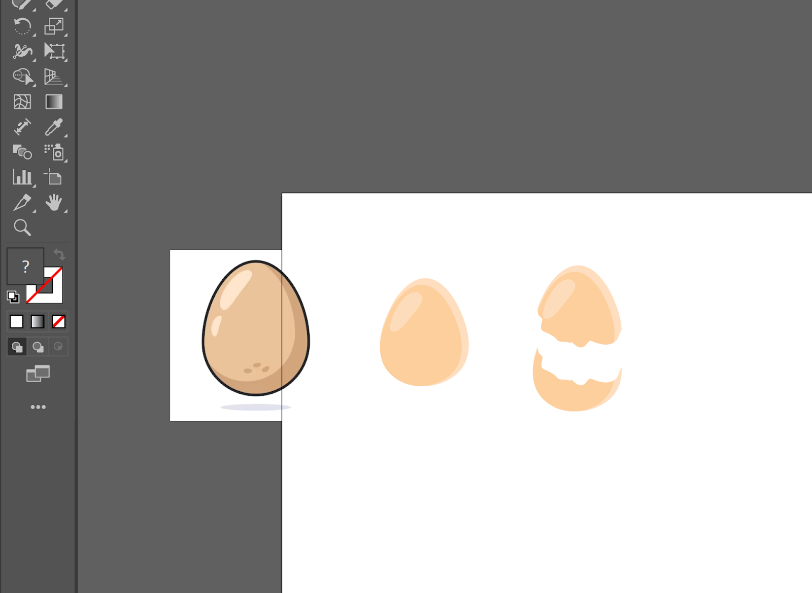 | |
|
To create the assets, I found some online references and adapted them to my style. To achieve the egg crack effect, I used the knife tool to cut the egg so that when I placed the pieces together, it looked like a full egg with cracks.
 | ||
|
To create the pot, I decided to make it in an isometric view so that the viewer can see what’s inside the pot. After trying out many different approaches, I found that adding a thick brown outline makes the overall look cuter.
 | ||
|
Throughout the assets I made, I either used gradients or patches of darker colors to create shadows. This adds depth to the illustration.
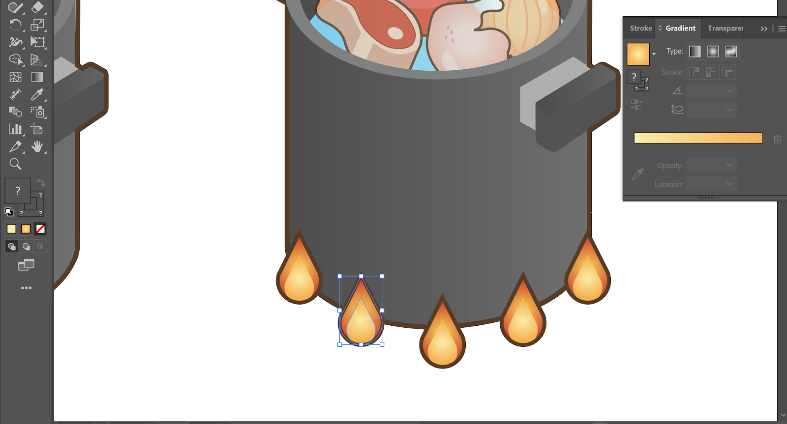 | ||
|
To enhance the cooking effect, I drew some flames around the pot.
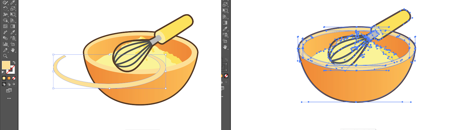 |
| Figure 5.5 Adding Layers - Week 3 (22/2/2024) |
For some of the assets, to make it appear as though the tools or food are inside the bowl or pot, I added one more layer on top to partially cover part of the object. This creates the illusion that the whisk is inside the bowl.
 | ||
|
These are all the assets I have created, with all my references listed on the left side.
 | ||
|
I also checked whether I missed out on any graphics by reviewing my ingredients list and step-by-step cooking instructions.
6. Designing the Poster
|
After creating all the assets, I moved the necessary graphics to a new page. To arrange my poster, I used a reflected "S" style to guide the cooking order. I also numbered them accordingly. I added round circles in front of the "S" line to make it visually clearer.
 | |||
|
I have organised all the ingredients based on stock, filling, and pasta sheet, separating them by different colors. I all made the ingredients section have a white background to distinguish the title from the instructions.
 | |||
|
This being an Italian Christmas dinner dish, I added some Christmas elements into the design. I tried to make my color palette match Italian colours.
 |
| Figure 6.4 Color Adjustment - Week 3 (23/2/2024) |
I also experimented with colors to capture both the essence of Christmas and Italian cuisine. Initially, on the right side, I tried using beige at the bottom. However, after consulting with my friends, they mentioned they only got a Christmasy feel and couldn't see the Italian influence. Consequently, I changed it to a gradient green, reminiscent of the Italian flag, which better conveyed the Italian theme.
Final Outcome
 |
| Figure 7.1 Final Designed Poster - Week 3 (23/2/2024) |
Figure 7.2 Final Designed Poster PDF - Week 3 (23/2/2024)
FEEDBACK
Week 3
The second sketch separates the information into different parts. If you want the picture of cappelletti like this, you should place it on the left side because we read from left to right. The flow of the fifth sketch is better as it flows from top to bottom. The last sketch is better than sketches 3 and 4. The font you use should be limited to 3 types (title, subtitle, and text). Using 2 or 3 colors is sufficient.
REFLECTION
Experience
I personally enjoyed this task a lot. I love looking at recipes, although I'm not very skilled in cooking myself. This project helped me understand the importance of clarity in infographics posters. I also found myself carefully reading through what I had designed, trying to put myself in the viewer's shoes and considering how I could make the poster even better. Although this exercise felt a bit rushed to me, especially since I'm going on a field trip to Japan for another module, I really did my best to create the assets and design the recipe poster.
Observation
I observed that by doing this project, I gained a lot of confidence in my ability to create infographics posters. I also noticed that when I was halfway done with my work, the overall style resembled textbook graphics or instant noodle cooking instructions, which I found to be hilarious.
Findings
After creating many assets, I discovered that I could actually copy the asset and use pathfinder to create outlines instead of drawing the lines one by one. I realized that I had wasted a lot of time doing it the long way, so I found myself feeling a bit foolish.


Comments
Post a Comment