Minor Project : Compilation & Reflection
23/4/2024 - 1/8/2024 : (Week 1- Week 15)
Ting Wen Yi / 0361799
Minor Project/Bachelor of Design (Hons) in Creative Media
Compilation & Reflection
After discussing our persona with the group members, we had to come up with some interview questions. I came up with 20 questions, and we combined our questions to make them better.
After many brainstorming sessions, I came up with a motif design of a half shield. We also started to do our presentation slides this week.
However, the lecturer suggested that we should incorporate gaming elements, given that the client expressed a preference for gaming stats and related themes. Considering this feedback, our group had a brief discussion about our new art direction and began integrating gaming elements into the designs while preserving the minimalistic aesthetic. So, our group leader created a concept board for us to refer to.
However, during class, the lecturer mentioned that neon and dark color backgrounds look old school. So, I designed a key visual first. Once it was approved by the lecturer, we were to follow that style.
For my third attempt, the lecturer said our design lacked consistency across the group and asked us to follow XiaoHui's and Jze Shin's website design approach.
So, I closely followed their design and the elements used. Here are the final designs for the Instagram stories:
Ting Wen Yi / 0361799
Minor Project/Bachelor of Design (Hons) in Creative Media
Compilation & Reflection
INSTRCTIONS
TASK 1: PROJECT PROPOSAL
Week 1
In the first week after we formed our groups, we started conducting contextual research on competitors and the market. I was responsible for researching news on functional T-shirts to use as evidence of their market need. At the end of the week, we had a small meeting to discuss what we had found.
During this week's online lecture, we met with our client, Mr. Damien. He roughly introduced what the brand will be selling. To top up our research, I was responsible for researching more news and articles about the trend and why people would wear the same or plain shirts.
 |
| Figure 2.1 Article Research - Week 2 (28/4/2024) |
Week 3
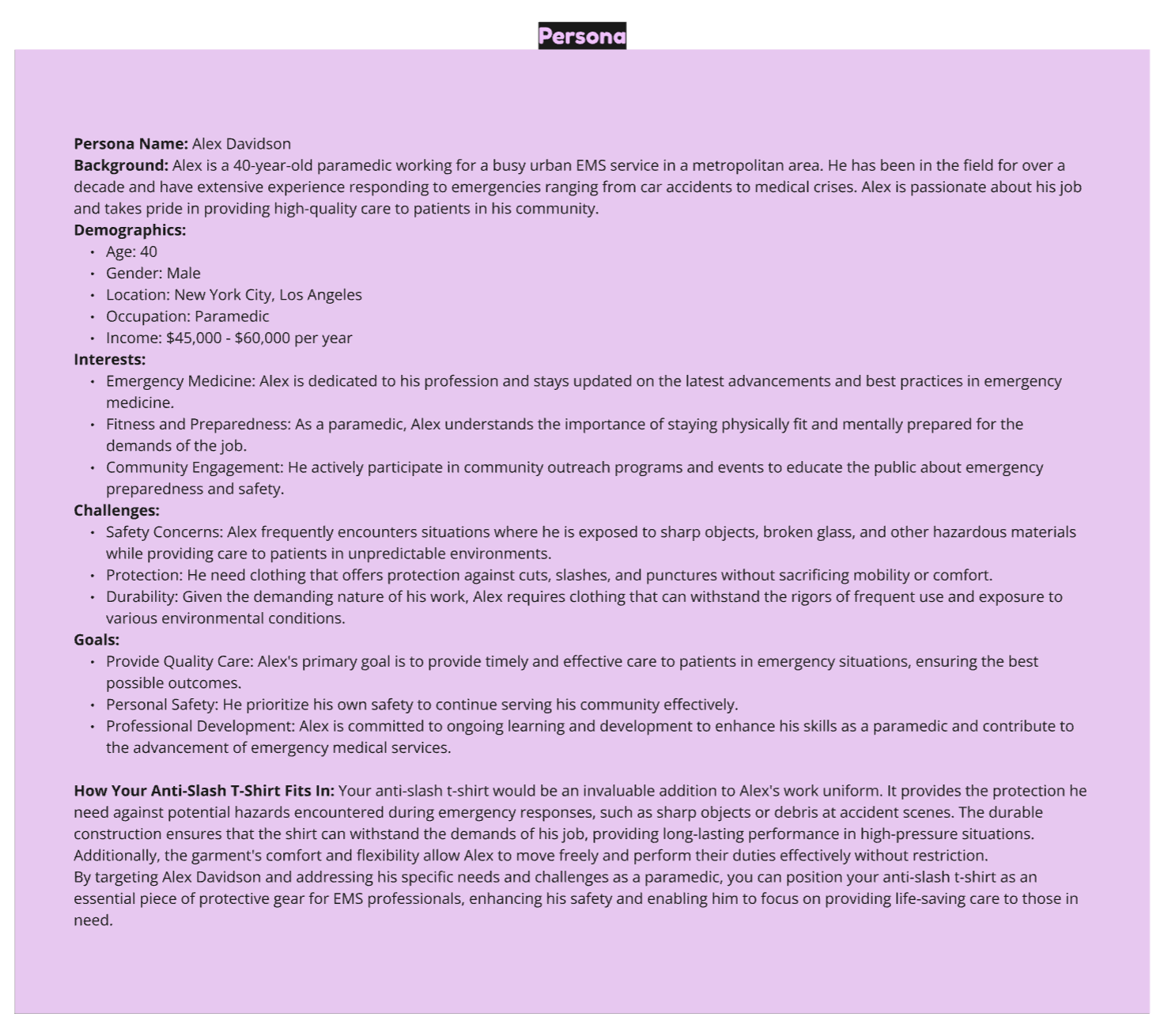
After we have al our contextual research and understanding the market we are to identity our target audience. I drew a table and separated it into two columns: one for anti-slash T-shirts and one for hydrophobic T-shirts. Each one of us has to come up with one persona. So I came up with one persona who is wroking in paramedic who would constantly encounter with sharp objects.
 | |
|
 | |
|
Week 4
We separated our survey questions into hydrophobic and anti-slash. WE let our lecturer to check our questions before we send out. I volunteer with JieYing to do the survey in Google Forms.
|
|
Week 5
This week on campus, we approached people around the campus to ask them to fill out our survey. We even bought candies for them as a token of appreciation. However, the client came and told us he decided not to pursue hydrophobic shirts. We were thoroughly disappointed. We do understand that clients often change their minds, so our lecturer asked us to use the information we gathered and apply it to anti-radiation shirts instead. So we quickly shifted to conducting interviews. I drafted the questions and interviewed an engineer.
 | ||
|
 | ||
|
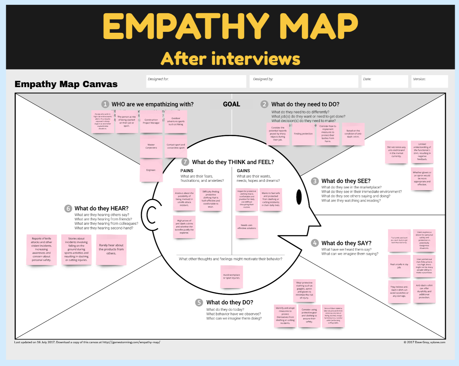
After every team member conducted interviews with their respective interviewees, we had a small online meeting to discuss and develop our empathy map, insights, and personas. I volunteered to do the user journey map.
Week 6
The lecturer pointed out some mistake in our empathy map. We discussion in the class and finished it in the next day. It was a little frustrating for me since we had to do everything twice for our two products. I wish our marks could double to reflect the extra effort.
I was more than happy to volunteer to do the design system where I get to do something that was more interesting like designing the logo etc.
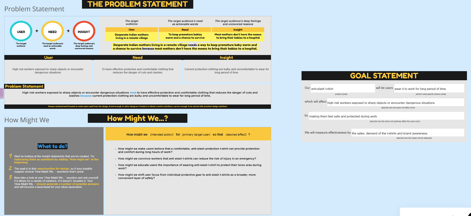
We had to revisit our insight statements because the lecturer mentioned that insights should be surprising and not something we initially thought of. After the lecturer gave us some examples of how to approach this, we went to the library to discuss and revise our insights and "How Might We".
 | ||
|
 | ||
|
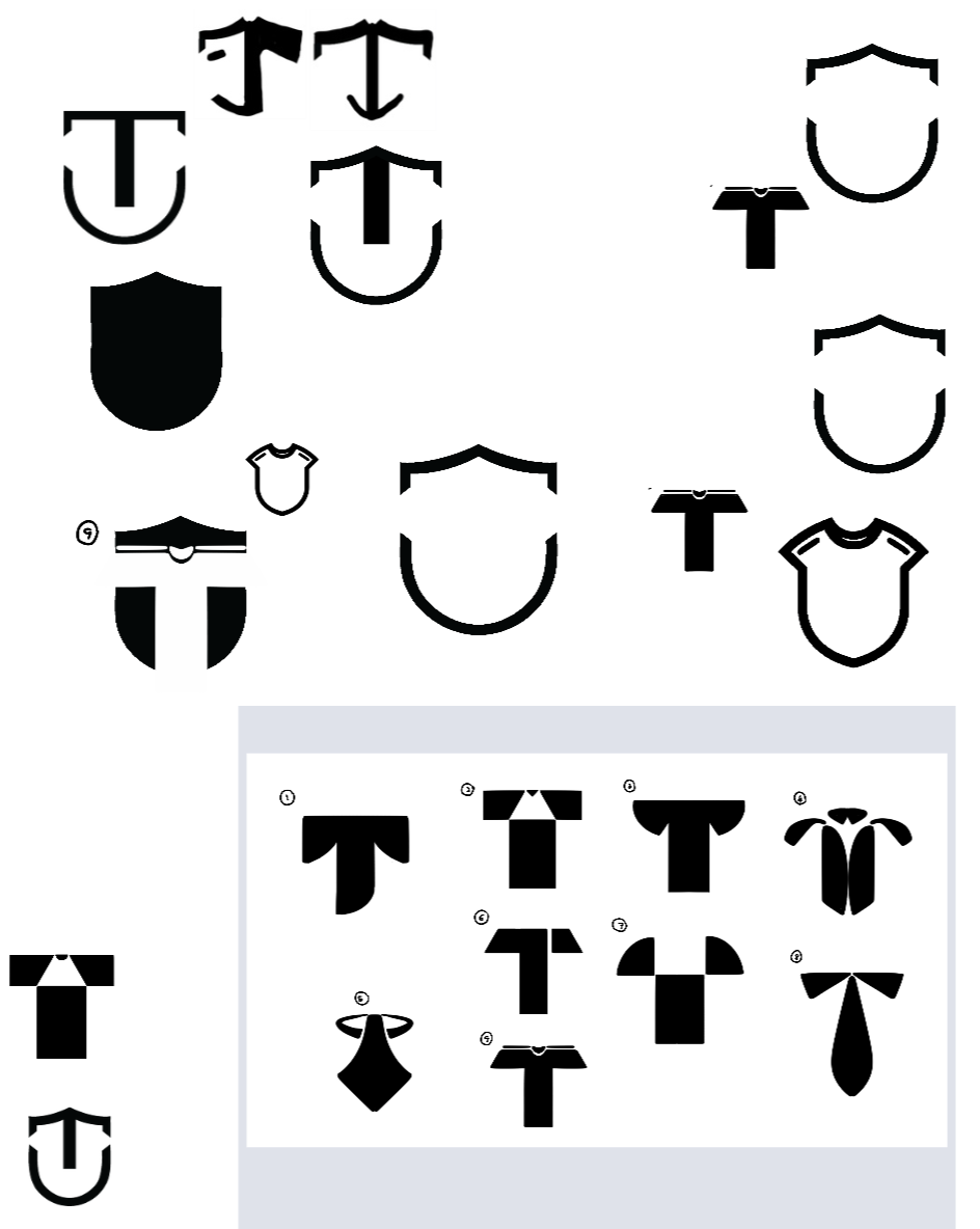
After we refined our insights, I had to redesign the design system to better align with our "How Might We" questions. I rethought the brand name and asked my team members to choose the best name from a list I provided. Additionally, I selected a new font and redesigned the logo.
 | ||
|
Week 8
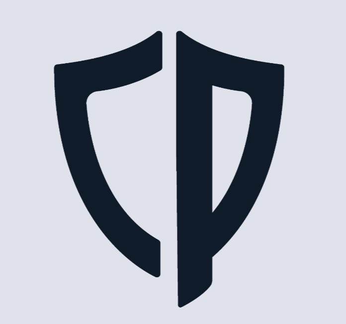
I have decided on a final logo for the brand. The logo resembles a shield, symbolizing protection and safety, which aligns perfectly with the brand's focus on providing protective apparel. The shape of the shield incorporates the letters "C" and "P," representing the brand name CozyProtec. This integration of the letters within the shield not only makes the logo unique and easily recognizable but also reinforces the brand identity.
 | ||
|
After many brainstorming sessions, I came up with a motif design of a half shield. We also started to do our presentation slides this week.
 | ||
|
Week 9
We are presenting to Mr. Damien this week. Before that, we made some minor changes to our slides after receiving feedback from Mr. Mike.
|
TASK 2: DESIGN DEVELOPMENT
Week 10
I volunteered to create a chart for our marketing campaign calendar, planning content for 6 months. I divided it into three platforms: Instagram, Facebook, and YouTube, as these are the most popular and relevant for our target audience. To maintain consistency and engagement, I outlined the type of content for each week and scheduled posts for days 1, 3, and 5. The detailed planning process required significant foresight but resulted in a cohesive strategy designed to keep our audience engaged and informed.
 | ||
|
Week 11
After showing my marketing campaign calendar to the lecturer, he pointed out that I missed one strategy: the marketing stage. I amended the calendar to include this stage, allowing our group leader, XiaoHui, to plan out the Gantt chart accordingly.
|
Week 12
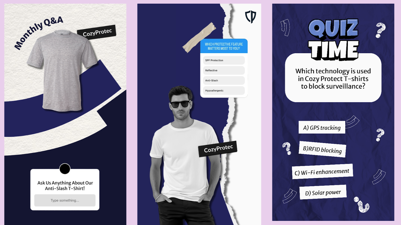
This week, I started designing Instagram stories to match the minimal design approach.
 | ||
|
However, the lecturer suggested that we should incorporate gaming elements, given that the client expressed a preference for gaming stats and related themes. Considering this feedback, our group had a brief discussion about our new art direction and began integrating gaming elements into the designs while preserving the minimalistic aesthetic. So, our group leader created a concept board for us to refer to.
 | ||
|
Week 13
So, I redesigned the stories with a clear game theme, using dark navy blue and neon blue.
 | ||
|
However, during class, the lecturer mentioned that neon and dark color backgrounds look old school. So, I designed a key visual first. Once it was approved by the lecturer, we were to follow that style.
 | ||
|
Week 14
 | ||
|
For my third attempt, the lecturer said our design lacked consistency across the group and asked us to follow XiaoHui's and Jze Shin's website design approach.
 | ||
|
So, I closely followed their design and the elements used. Here are the final designs for the Instagram stories:
 |
| Figure 14.3 Story Post 1 - Week 14 (25/7/2024) |
 |
| Figure 14.4 Story Post 2 - Week 14 (25/7/2024) |
 |
| Figure 14.5 Story Post 3 - Week 14 (25/7/2024) |
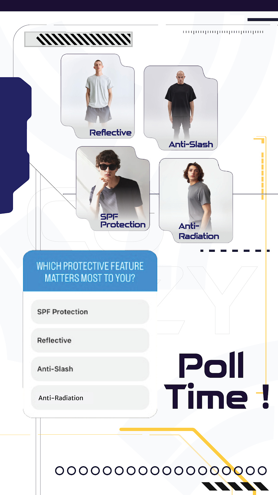 |
| Figure 14.6 Story Post 4 - Week 14 (25/7/2024) |
 |
| Figure 14.7 Story Post 5 - Week 14 (26/7/2024) |
 |
| Figure 14.9 Story Post 7 - Week 14 (26/7/2024) |
TASK 3: FINAL PRESENTATION
| Figure 15.2 Final Presentation Slides - Week 15 (31/7/2024) |
REFLECTIONS
Week 14: This week, Mr. Chong checked our progress. He mentioned that we should align the art style very consistently; for example, if there isn't a drop shadow in one piece, then don't use it in others. So, I had to make some changes to align with XiaoHui's design. I finalised all my Instagram stories' designs, and we also had to prepare our presentation slides. I design the presentation slides according to our theme.
Week 13: This week, I designed the Instagram stories according to our new art direction. I used mainly dark navy blue with some neon blue elements throughout the whole design. During the feedback session, the lecturer mentioned that it looked very old-fashioned and suggested ways to better represent gaming, comfort, and protection in our design. He provided some examples for reference, so I started by designing a key visual. We slightly adjusted our color palette and added a new font. After the lecturer approved the key visual, we continued with our tasks. I switched to a white and greyish design for a more modern and versatile look.
Week 12: This week, we started working on our designs. I was responsible for designing Instagram stories. As I began, I adhered to our art direction, which is minimalistic. I created a few posts that were super minimal while using our color palette. However, the lecturer mentioned that we should incorporate gaming elements, as the client expressed a preference for gaming stats and related themes. Taking this feedback into account, our group had a small discussion about our new art direction and began to integrate gaming elements into the designs while maintaining the minimalistic aesthetic.
Week 11: This week, the lecturer pointed out that we should have a marketing stage to announce the website and the product launch. As a result, I refined the table to include a marketing stage that provides a compelling hook to encourage customers to make a purchase. To do this, I added a pre-launch phase where we build anticipation and excitement through teasers and countdowns on all our platforms: Instagram, Facebook, and YouTube. In the announcement stage, I planned a coordinated campaign to reveal the website and launch details. This involves a series of posts and stories that guide our audience to the new website, offering special promotions and exclusive deals for early buyers.
Week 10: This week, I volunteered to create a chart for our marketing campaign calendar. I had to plan 6 months of content. I separated it into three different platforms: Instagram, Facebook, and YouTube, as these platforms are the most used and suitable for our target audience. To ensure consistency and engagement, I planned the type of content to produce for each week and specified posts for days 1, 3, and 5. The planning process was detailed and required a lot of foresight, but it helped in creating a cohesive strategy that will keep our audience engaged and informed.
Week 9: This week, we quickly amended our presentation slides and then prepared ourselves for the presentation. We did a group practice session the day before the presentation. On Friday, we presented to Mr. Damien, who gave us some suggestions and feedback. He mentioned that we could include statistics in gaming for our t-shirt on the website, with stats on what it does and star ratings for different aspects to help customers choose the best t-shirt that suits their needs.
Week 7: This week, the lecturer gave feedback on our insight statements. He mentioned that our insights should be surprising and something we wouldn't have thought of. The lecturer worked with us on the anti-radiation insights, guiding us on how the statements should look. Then we had to complete the anti-slash insights ourselves. To be honest, having two products feels like doing double the work. Every task has to be done twice. So, after revising our insights, I had to rethink my design for the design system. I had to reconsider the branding to ensure it aligns more closely with the insights and the "how might we" statements. So, I continued with the design system, focusing on the brand name, logo, typography, art direction, key visuals, and other elements.
Week 6: This week, we continued refining our empathy map. With time running out, our group leader assigned tasks to everyone, and I volunteered to work on the design systems. I was happy to take on something more interesting. I started brainstorming brand names that would suit our project and worked on typography, color palettes, and other elements. I sensed that the leader was stressed and frustrated because one group mate was not being cooperative. He was busy with other modules, just like the rest of us, but I think he wasn't managing his time properly. Despite having other modules with much more work, I still managed to contribute effectively.
Week 5: This week, we approached students around campus and asked them to fill out our survey. Unfortunately, Mr. Damien decided not to participate in the hydrophobic T-shirt project. We then adapted our plan and used the survey information as a reference to conduct interviews for both functional T-shirt options. Later that week, after the interviews, we held a meeting to discuss and develop our empathy map, insights, and personas. I was also responsible for analyzing the data from the online survey.
Week 4: This week, we made progress in creating our survey using Google Forms. We compiled the main survey questions and categorized them into "anti-slash" and "hydrophobic." The lecturer provided feedback, and we improved our survey questions before sending them out. I was responsible for adding the questions related to hydrophobic into Google Forms.
Week 3: This week, we progressed by identifying our target audience, narrowing down and targeting fewer people who would be our potential customers. Each of us created one persona and developed some interview questions specific to that particular individual. We had a small discussion on Friday to combine our interview questions.
Week 2: This week, we met with our client, Mr. Damien, who provided explanations about the brand. We asked some interview questions to clarify certain aspects and the direction we are heading. Based on the information provided, I was responsible for researching more news/articles about the trend and why people would wear the same shirt/plain shirt.
Week 1: This week, we began with a briefing session and formed groups to select projects we are interested in. To kick-start the project, our group leader delegated tasks, and I was responsible for conducting news research on various functional shirts that could be useful for our product. For example, for slash-proof shirts, I searched for news articles about incidents involving slashing or killing to demonstrate the needs of such shirts.







Comments
Post a Comment