Interactive Design - Final Project : Single Page Lifestyle Microsite

Ting Wen Yi / 0361799
Interactive Design/Bachelor of Design (Hons) in Creative Media
Final Project: Single Page Lifestyle Microsite
INSTRUCTIONS
Project Overview:
In this web design project, you will create a single-page website dedicated to your favorite artist. This project will help you develop your web design and development skills while allowing you to showcase your passion for the artist of your choice.
Project Requirements:
Artist Selection: Choose your favorite artist as the subject of your website. It can be a musician, painter, actor, or any other creative individual or group. Ensure you have a genuine interest in the artist, as this will help you create a more engaging website.
Content:
Your single-page website should include the following sections:
- Header with the artist's name and a brief tagline.
- Introduction: Provide an overview of the artist's background and why you admire them.
- Gallery: Showcase images, videos, or other multimedia related to the artist's work.
- Biography: Include a brief biography or description of the artist's life and career.
- Contact Information: If applicable, include contact details or links to the artist's social media profiles.
Design Elements:
- Choose a color scheme and fonts that reflect the artist's style or your personal taste.
- Ensure a visually appealing layout with a balanced use of text and multimedia.
- Create a responsive design that adapts to different screen sizes (mobile-friendly).
Navigation: Implement smooth scrolling navigation or a simple menu that allows users to jump to different sections of the page.
Interactivity: Consider adding interactive elements such as image sliders, hover effects, or lightboxes for multimedia content.
FINAL PROJECT : SINGLE PAGE LIFESTYLE MICROSITE
1. Chosen Artist
 |
| Figure 1.1 Lauv - Week 9 (29/10/2023) |
 |
| Figure 1.2 Background Research on Miro - Week 9 (29/10/2023) |
In this final project, we are required to select our favorite artist as the subject of our website. I have chosen Lauv as my artist. To kickstart the project, I am conducting background research on Lauv to gain a better understanding of him, which will assist me in designing a website that accurately represents his style and persona.
2. Mood Board
 |
| Figure 2.1 Mood Board - Week 9 (29/10/2023) |
I've created a mood board categorized to reflect the style of the website, inspired by Lauv. It embodies a colorful, pastel, and dreamy aesthetic. For the fonts, I've chosen Kenia, Black Ops One, Alumni Sans, and Collegiate One for titles. Additionally, I've considered Chakra Petch and/or Teko for the body text. Lastly, I've curated a color palette with vibrant, colorful, and pastel tones that resonate with Lauv's style.
3. Visual Reference
Website 1: https://www.elizabethstiles.co.uk/
 |
| Figure 3.1 Visual Reference 1 - Week 9 (29/10/2023) |
I like this website because it incorporates fun elements such as geometric shapes, grid lines, and a vibrant color palette with strong contrasting colors.
Website 2: https://drinkolipop.com/
 |
| Figure 3.2 Visual Reference 2 - Week 9 (29/10/2023) |
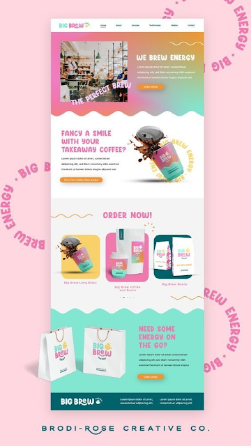
I like this website because it features a very colorful, yet minimal and organized, design for a soda. The use of ample white space helps balance the colorful elements, preventing the site from feeling overwhelming. Each section is well-segmented, ensuring a clear and structured presentation of information. The website also utilizes high-quality, colorful imagery that complements the brand and product offerings.
Website 3:
 |
| Figure 3.3 Visual Reference 3 - Week 9 (29/10/2023) |
Website 4:
 |
| Figure 3.4 Visual Reference 4 - Week 9 (29/10/2023) |
This website maintains consistency in branding elements throughout, ensuring a cohesive and unified look. Brand colors, logos, and visual motifs are consistently applied, reinforcing the brand identity.
All my visual references lean towards playful and pastel colors because Lauv's aesthetic embodies that style.
Website 5:
 |
| Figure 3.5 Visual Reference 5 - Week 10 (4/11/2023) |
Mr. Shamsul mentioned that I can find additional visual references similar to my sketches. This website closely resembles what I aim to achieve; it begins with pictures on the side and an introduction, followed by another picture and an "About the Author" section.
Website 6:
 |
| Figure 3.6 Visual Reference 6 - Week 10 (4/11/2023) |
This website is minimal and easy to understand. It's obvious that the information is presented row by row, with different colors.
4. Sketches/Wireframe
 |
| Figure 4.1 Sketches - Week 9 (29/10/2023) |
Figure 4.2 Sketches PDF - Week 9 (29/10/2023)
I have created five website sketches using Adobe Illustrator. I have chosen the first sketch to be my webpage design.
Figure 4.3 Final Sketches PDF - Week 10 (4/11/2023)
5. Prototype
 | |
|
I use Figma to create my prototype. To make it easier for me to reference my sketches, I place them next to my page.
 |
| Figure 5.2 Prototype - Week 10 (4/11/2023) |
I aim for a minimal design with colorful backgrounds that represent Lauv's character. I've included some of his most popular songs under the 'Gallery' section. For the 'Contact Us' picture below, I removed the background and added a thick outline around it using the color scheme of my theme.
 |
| Figure 5.3 Final Prototype - Week 11 (9/11/2023) |
6. HTML, CSS & JavaScript
Navigation Bar & Home
 |
| Figure 6.1 Navigation Bar & Home - Week 12 (16/11/2023) |
I have created a sticky navigation bar that sticks to the page as I scroll. I planned out the containers and divs to ensure responsiveness and organization.
 |
| Figure 6.1 Navigation Bar & Home HTML - Week 12 (16/11/2023) |
From my HTML code, you can see that the header is like the top part of the page. It has the logo on the left and the menu with links (like Home, About, etc.) on the right.
Now, the Home section is like a introduction on the page. It's split into two parts side by side. On one side, there's a picture of Lauv. On the other side, there's a big title saying who Lauv is, and a little story below that talks about his music style and what he's all about.
About
 |
| Figure 6.3 About - Week 12 (16/11/2023) |
This section on the webpage is all about Lauv. It's laid out in two parts, like a split-screen view. On the left side, there are three columns. Each column talks about a different aspect of Lauv's career. The first part highlights Lauv's breakthrough with his song "I Like Me Better," which was a huge hit in 2018. The second part discusses Lauv's music style, which is a mix of pop, electronic, and R&B. It talks about how his music connects with people on a personal level. The third part focuses on Lauv's collaborations with other artists, like Troye Sivan and Anne-Marie, and how these collaborations helped him reach more fans.
On the right side, there's a picture of Lauv, giving a visual element to the whole story. This setup helps visitors to see both the information and a picture of Lauv at the same time, making it more engaging and interesting to read.
 |
| Figure 6.4 About HTML - Week 12 (16/11/2023) |
The row class contains two main columns (.column-2), dividing the section into left and right sides. On the left side, there are three columns (column-left, column-middle, column-right) with headings and paragraphs describing Lauv's career. On the right side, there's an image of Lauv (<img>) giving a visual representation to the information.
Gallery
 |
| Figure 6.5 Latest Album - Week 12 (16/11/2023) |
Unfortunately, I couldn't embed the original video of the song due to copyright issues. As an alternative, I found another source and embedded the song's lyrics from a different channel.
 | |
|
To do this, I simply added the title and embedded a YouTube video. I used <center></center> to position the video in the center.
 |
| Figure 6.7 Popular Songs - Week 12 (16/11/2023) |
In the 'Popular Songs' section of my webpage, I've featured a dynamic carousel displaying Lauv's hit songs. Each song includes a title with year, its album cover, and an embedded audio player.
 |
| Figure 6.8 Popular Songs HTML - Week 12 (16/11/2023) |
Within the section, a <div> with a class "slider" is present, used to contain the carousel. Inside the "slider" div, there's another <div> with a class "slides" which holds the individual song slides.Each song slide is enclosed within a <div> with a class "slide". Within each slide:There's a <p> element displaying the song title and year. An <img> tag displaying the album cover associated with the song. An <audio> tag with controls to play the song, each with a <source> tag pointing to the audio file's location.
 |
| Figure 6.9 Popular Songs Button - Week 12 (16/11/2023) |
 |
| Figure 6.9 Popular Songs JavaScript - Week 12 (16/11/2023) |
To enable the smooth movement through these song slides, I've added JavaScript functionality. This JavaScript code works by altering the position of the slides to simulate a carousel, displaying a limited number of songs at a time and allowing users to navigate through Lauv's popular songs using the provided buttons.

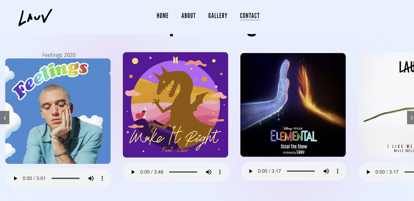
Figure 6.11 Difference Between Subtitle - Week 12 (16/11/2023)
I initially intended to position the song name beneath the album picture same as my prototype design. However, after trying that layout, I felt it didn't look good. So, I experimented with placing it above the picture, and it turned out to look much better.
Contact
 |
| Figure 6.12 Contact Us - Week 12 (16/11/2023) |
In the "Contact Us" section, I've designed a way for visitors to get in touch while providing some essential contact information. The layout comprises two distinct sections side by side.
On the left side, I've set up a contact form divided into four sections: Full Name, Email Address, Subject, Messages. There's a clear placeholder for each field, allowing users to easily input their details and message. Below these sections, there's a button labeled "Submit" designed to send the entered information to the specified action URL.
The right section displays contact details in a structured manner within individual boxes:
- Phone Icon: Showing the contact phone number.
- Email Icon: Displaying the email address for inquiries.
- Web Icon: Linking to Lauv's official website.
 |
| Figure 6.13 Contact Us HTML - Week 12 (16/11/2023) |
Footer
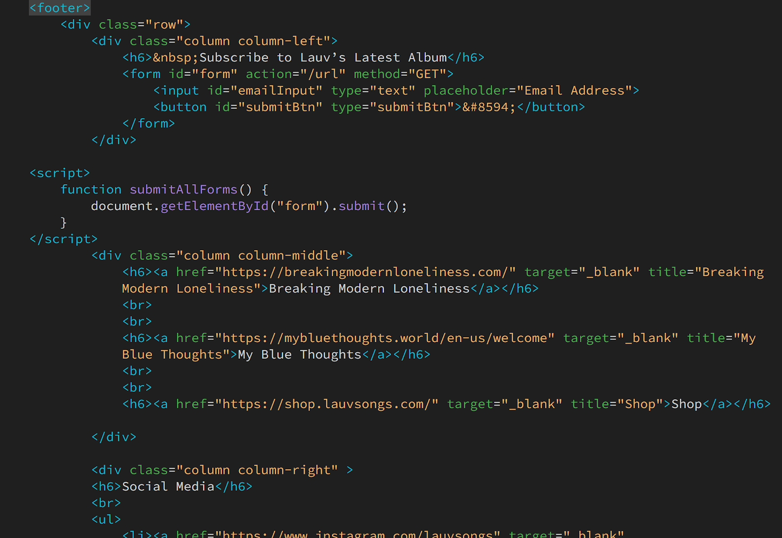
 |
| Figure 6.14 Footer - Week 12 (16/11/2023) |
This footer essentially functions as a comprehensive footer, integrating subscription options, essential links to Lauv's projects, and direct access to his social media profiles, ensuring visitors have multiple means to stay connected and engaged.
 |
| Figure 6.15 Footer HTML - Week 12 (16/11/2023) |
- The footer is divided into three main columns (left, middle, and right) within a row.
- Subscription Section (Left Column): Contains a subscription form for users to input their email address to subscribe to updates related to Lauv’s latest album.
- Featured Links (Middle Column): Showcases important links like "Breaking Modern Loneliness," "My Blue Thoughts," and a direct link to the "Shop."
- Social Media Integration (Right Column): Provides links to Lauv's social media profiles, including Instagram, Facebook, Twitter, YouTube, Spotify, and Apple Music.
Week 13
 |
| Figure 7.1 Screenshot of Web Design - Week 13 (21/11/2023) |
I have created two versions of the website for responsive viewing. In the first version, the arrangement of the sections under the 'About Lauv' column is stacked one below the other. In the second version, the layout resembles the laptop version, with the columns placed next to each other on smaller screens.
 |
| Figure 7.2 Screenshot of Responsive View (V1) - Week 13 (21/11/2023) |
Responsive View (Version 2) Website Link: Click Here!
 |
| Figure 7.3 Screenshot of Responsive View (V2) - Week 13 (21/11/2023) |
Final Web Design
Website Link: Click Here!
 |
| Figure 8.1 Screenshot of Final Web Design - Week 14 (28/11/2023) |
Figure 8.2 HTML Code - Week 14 (28/11/2023)
Figure 8.3 CSS Code - Week 14 (28/11/2023)
FEEDBACK
Week 14: Remove "..." behind I Am Lauv. Website 2 is better in responsive view.
Week 13: Reduce the font size for the headings. There's a significant difference in size between the paragraphs and the headings.
Week 11: Left-align the content in the footer for a neater appearance. Remove the background color box from the contact section. Ensure consistency in the radius of all images. Limit the use of two types of fonts.
Week 10: My design philosophy is minimalism. Try to do something more minimal, you can proceed with the first sketch and try to make prototype. You can also find more visual references that are more similar to your design.
REFLECTION
This assignment has been a tremendous learning experience for me in coding, particularly because it was my first time using JavaScript. Even though it wasn't a part of our scope of study, I managed to grasp some basics through this exercise. JavaScript truly brings a webpage to life with its scrolling and navigation capabilities. Completing this assignment give me sense of satisfaction – there's a sense of joy, especially since I designed a webpage for my favorite artist. Although I've finished the final task for this subject, I'm motivated to keep upgrading my skills and learn more about coding.


Comments
Post a Comment