Advanced Typography - Task 1: Exercises
30/8/2023 - 20/9/2023 : (Week 1- Week 4)
Ting Wen Yi / 0361799
Advanced Typography/Bachelor of Design (Hons) in Creative Media
Task 1 / Exercise 1 & 2
Week 1 - Lecture 1

When working on the Dilatational system, my goal was to create a captivating circular wave effect that would visually engage the audience. In my initial attempt, I decided to give the title a circular motion, creating a dynamic and attention-grabbing focal point. For the date and guest information, I opted for a wave-like design, interconnecting them to symbolize the fluidity and interconnectedness of the event's elements. After experimenting with other ideas, I realized the first concept captured the event's essence best. To amplify its impact, I maintained the same color theme and added a subtle gray shadow to the title for emphasis, creating a dynamic and engaging design.
For the Modular System, it's somewhat similar to the Grid System, but I decided to box up some of the words.
For the bilateral project, Mr. Vinod mentioned that using two contrasting colors gives a bipolar impression, but he approves of the arrangement. As a result, I have changed the contrasting colors and fonts while keeping the arrangement the same.
I refined the Random system by making the guest and date details more random and reducing the number of copies.
I extracted the letters T, K, N, E, Z, and Y from the image. I extracted six letters, one more than Mr. Vinod required (5), to provide myself with more options during the refinement process. I also noticed from the tracing results that the letters have sharp edges and a mixture of thin and thick strokes.
2. Refinement
I began the refinement process by rotating and enlarging the size of the letters to ensure consistency in their appearance. I then refined the letters to make them more distinct and recognizable. In the final stage, I compared the letters to my reference and adjusted where necessary to balance the thin and thick strokes.
While refining the letters, I use guidelines to assist me in achieving precision and consistency. These guidelines acted as visual references, ensuring that each letter's strokes, angles, and proportions matched the desired result.
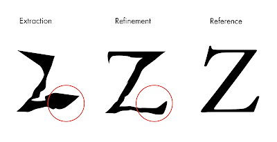
For the letter Z, I noticed that the extracted version had a bold stroke at the tail. To correct this, I referred to the reference typeface and refined the letter, giving it a thin and pointed tail.
I applied similar adjustments to all the letters in the same manner.
3. 2nd Attempt
Reference
Elam, K. (2007). Typographic Systems of Design (1st ed.). Princeton Architectural Press.
Learning Outcome
Ting Wen Yi / 0361799
Advanced Typography/Bachelor of Design (Hons) in Creative Media
Task 1 / Exercise 1 & 2
CONTENT / LINK
LECTURES
Week 1 - Lecture 1
Advanced Typography: Typographic Systems
The typographic systems function similarly to shape grammars in architecture, employing unique rules that guide decision-making and provide a focused framework for learners' exploration, fostering intuition development.
1. Axial - All elements are organised to the left or right of a single axis.
2. Radial - All elements are extended from a point of focus.
3. Dilatational - All elements expand from a central point in a circular fashion.
4. Random - Elements appear to have no specific pattern or relationship.
5. Grid - A system of vertical and horizontal divisions.
6. Modular - A series of non-objective elements that are constructed in as a standardized units.
7. Transitional - An informal system of layered banding.
8. Bilateral - All text is arranged symmetrically on a single axis.
Week 2 - Lecture 2
Advanced Typography: Typographic Composition
The principles of design composition can be applied to typography to create more effective and visually appealing typographic layouts. Some of the most important principles include emphasis, isolation, repetition, symmetry and asymmetry, alignment, and perspective. By understanding these principles and applying them to their work, designers can create typographic layouts that are both clear and engaging.
1.Principles of Design Composition: Emphasis, isolation, repetition, balance (symmetry/asymmetry), alignment, perspective, rhythm and contrast.

Figure 2.1 Principle of Design - emphasis
2.The Rule of Thirds: A photographic guide to composition. The intersecting lines are used as a guide to place the points of interest., within the given space.
Figure 2.2 The Rule of Thirds
3.Environmental Grid: Based on the exploration of an existing structure or numerous structures combined.
4.Form and Movement: Based on the exploration of existing Grid Systems. The placement of a form on a page, over many pages creates movement. The forms could represent images, text or colour.
 |
| Figure 2.4 Form and movement |
Week 3 - Lecture 3
Advanced Typography: Context and Creativity
Handwriting is crucial in typography as it inspired the first mechanically produced letterforms, mimicking its style. Hand-drawn letter shapes and lines are influenced by tools, materials, and writing surfaces.
1. Cuneiform c. 3000 B.C.E
The first letterforms created mechanically were intended to closely resemble handwriting. Mechanical type would aim to imitate handwriting's shape, space, and traditions as the foundation or standard.
The oldest form of writing, developed from pictograms, was written from left to right.
2. Egyptian Hieroglyphs
Egyptian hieroglyphics, a writing system intertwined with relief carving, combined rebuses and phonetic characters. Hieroglyphic images served three purposes: as ideograms representing actual objects, as determinatives indicating the general idea of a word, and as phonograms spelling out individual words. This system laid the foundation for future alphabetic systems.
3. Letterforms through the Ages
 |
| Figure 3.3 Letterforms through the Ages |
Early Greek (5th C. B.C.E.): Drawn freehand, not constructed with compasses and rules, and they had no serifs. In time the strokes of these letters grew thicker, the aperture lessened, and serifs appeared.
Roman Uncials: By the 4th century Roman letters were becoming more rounded, the curved form allowed for fewer strokes and could be written faster.
English Half Uncials (8th C.): In England, the uncial evolved into a more slanted and condensed form.
Carolingian Minuscule: Capitals at the start of a sentence, spaces between words and punctuation. It was this style that became the pattern for the Humanistic writing of the fifteenth century; this latter, in turn, was the basis of our lower-case roman type.
Black Letter (12-15 C. CE): Characterized by tight spacing and condensed lettering. Evenly spaced verticals dominated the letterform. Condensing line spacing and letter spacing reduced the amount of costly materials in book production.
The Italian Renaissance: Newly rediscovered letterforms Antica. The renaissance analysis of form that was being applied to art and architecture was directed toward letterform — resulting in a more perfect or rationalized letter.
4. The Indus Valley Civilization (IVC)
The Indus Valley Civilization (IVC), dating back to 3500-2000 BCE, had a script that remains undeciphered. The script appears to be logo-syllabic, combining symbols that may have represented both sounds and concepts. There are differing opinions on whether the symbols are non-linguistic or represent a Dravidian language.
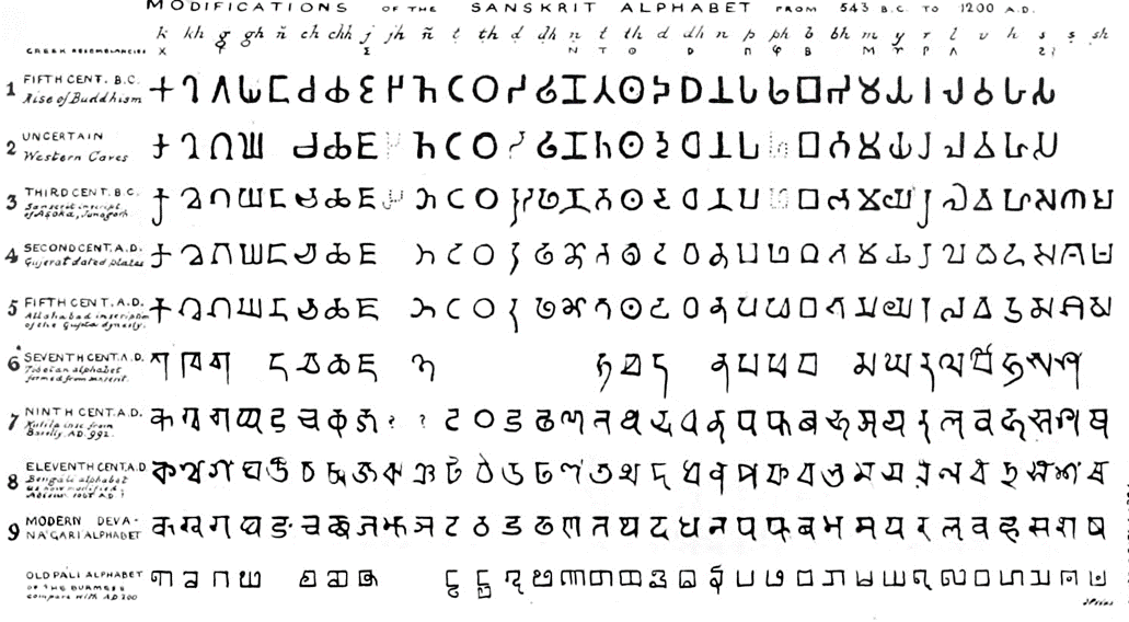
5. The Brahmi Script
India produced the first writing system after the Indus script. All contemporary Indian scripts as well as several hundred other scripts found in Southeast and East Asia are descended from Brahmi, one of the most prominent writing systems.
Week 4 - Lecture 4
Advanced Typography: Designing Type
In the introduction of his typeface Malaga, Xavier Dupré (2007) suggested that designing a typeface serves a dual purpose: it carries a social responsibility by continuously enhancing legibility while also providing a platform for artistic expression.
Type Design Process
1. Research
- Understand type history, anatomy, conventions, and terminologies.
- Determine the intended purpose and specific applications of the typeface.
- Consider usage scenarios such as school buses or airport signage.
- Examine existing fonts for inspiration, ideas, and usage patterns.
2. Sketching
Traditional Tool Set Method:
- Designers use brushes, pens, ink, and paper to sketch typefaces.
- Sketches are scanned for digitization.
- Provides better control and confidence with hand movements.
Digital Tool Set Method:
- Designers use digital tools, like Wacom tablets, within font design software.
- Allows for quicker, more persistent, and consistent results.
- Can impede the natural movement of hand strokes.
Positives and Negatives:
a) Traditional Tool Set Method:
- Positive: Better control and confidence in hand movements.
- Negative: Additional steps are required for digitization.
b) Digital Tool Set Method:
- Positive: Quick, persistent, and consistent results.
- Negative: Potential loss of natural hand stroke movement.
3. Digitization
- Leading software for typeface digitization: FontLab and Glyphs App.
- Some designers use Adobe Illustrator for initial design before transferring to font apps (not favored by purists).
- Pay attention to both the whole form and counter form for readability.
4. Testing
- Testing is a crucial aspect of the design thinking process, aiding in refining and correcting aspects of the typeface.
- Prototyping is a key part of testing and provides valuable feedback.
- Readability and legibility are particularly important considerations for text typefaces, while display typefaces prioritize expressive form over readability.
- The typeface category influences the level of emphasis placed on readability and legibility.
5. Deploy
- Teething problems may arise even after deploying a completed typeface that was not identified during the prototyping and testing phases.
- The task of revision continues even after deployment to address these unforeseen issues.
- Thorough testing is crucial to minimize the occurrence of major teething problems.
- The rigor of testing helps identify and address minor issues in the typeface.
Typeface Construction
Employing a grid system that incorporates circular shapes can be advantageous when crafting Roman capital letterforms. This grid comprises a square intersected by a circle, with the circle touching the square's lines at four specific points. Furthermore, a smaller rectangle, located at the square's center, is sized at three-quarters of the square's dimensions. This approach presents a viable method for constructing and shaping letterforms. For additional insights and in-depth information, referring to the provided sources is recommended.
 |
| Figure 4.3 Construction grid for the Roman Capital using 8 x 8 cells. |
Construction and Considerations
Designing a typeface involves factors like shaping curves, aligning vertically, and adjusting letter spacing. However, the complexity of typeface creation can't be fully covered in a single lecture. Further exploration through reading is recommended to delve deeper into this subject, considering various additional approaches and considerations.
Figure 4.4 Construction and Considerations
Week 5- Lecture 5
Advanced Typography: Perception and Organisation
Perception pertains to how something is understood, including whether it's based on genuine observation or influenced by manipulation. In typography, it relates to guiding the reader's visual experience through elements like contrast, form, and content organization, with a specific focus on text presentation.
Contrast
There are several methods in typography to create contrast.
1. Size
Size contrast directs attention by making certain elements larger than others. For example, a big letter will be noticed before a small one. This is often used in titles or headings to make them stand out from the body text.
2. Weight
Weight refers to how bold type stands out among lighter type of the same style. It can be achieved through bold type, as well as using rules, spots, and squares to create visual emphasis. Weight is not limited to type alone, as other design elements can also provide powerful points of attraction or emphasis.
3. Form
The contrast of form encompasses distinctions between capital and lowercase letters, regular and italic variants, as well as condensed and expanded versions within a typeface.
4. Structure
Structure refers to the distinct letterforms found in different types of typefaces. Examples include the contrasting characteristics of a monoline sans serif compared to a traditional serif, or the differences between an italic and a blackletter typeface.
5. Texture
By combining size, weight, form, and structure contrasts in a block of text, we achieve the contrast of texture. Texture refers to the overall appearance of the lines of type, influenced by both the letterforms and their arrangement on the page.
6. Direction
The contrast of direction involves the opposition between vertical and horizontal orientations, as well as the angles in between. It can be achieved by rotating words or combining wide blocks of long lines with tall columns of short lines, resulting in a visually striking contrast.
7. Color
Considerations should be given to emphasize specific elements and pay attention to the tonal values of colors used, as a secondary color tends to have less emphasis than plain black on white.
INSTRCTIONS
Task 1: Exercise 1 - Typographic Systems
In this exercise, we are required to delve into eight typographic systems, specifically Axial, Radial, Dilatational, Random, Grid, Modular, Transitional, and Bilateral. We will be using Adobe InDesign to implement these systems, utilizing the content provided in the Module Booklet.
Specifications:
- Size: 200 x 200 mm.
- Colors: Black and one additional color.
- Limited use of graphical elements (lines, dots, etc.).
1. Axial System
 |
| Figure 6.1.1 Axial System Attempt 1 - Week 1 (30/8/2023) |
During our Week 1 practical session, Mr. Vinod assigned us the task of watching a tutorial video on Axial System Typography and then attempting to implement it using InDesign. At first, I began by experimenting with the arrangement, but I quickly realized that it felt rigid and uninteresting. I started to play around with the arrangement, but I found it to be stiff and boring, so I played with the fonts and sizes of the headings.
 |
| Figure 6.1.2 Axial System Attempt 2 - Week 1 (31/8/2023) |
After that, I added colors. I chose a black background to create a striking contrast and used shades of blue, white, and grey as subtle shadows for the content.
Fonts: Gill Sans Std (Bold), Helvetica (Light Condensed), Futura Std (Medium, Extra Bold Condensed, Light, Book, Bold Condensed)
2. Radial System
 |
| Figure 6.1.3 Radial System Attempt - Week 1 (3/9/2023) |
For the Radial System, my first and second attempts involved placing two circles on different sides, each containing different information. However, I felt that this arrangement was rather dull and rigid. Therefore, I opted for a single large semi-circle, with all the data surrounding the circular shape. Additionally, I added some lines to give the impression of the words 'shouting' out from the design.
Fonts: Gill Sans Std (Bold), Helvetica (Light Condensed), Futura Std (Medium, Bold, Light, Book, Bold Condensed)
3. Dilatational System
 |
| Figure 6.1.4 Dilatational System Attempt - Week 1 (3/9/2023) |
When working on the Dilatational system, my goal was to create a captivating circular wave effect that would visually engage the audience. In my initial attempt, I decided to give the title a circular motion, creating a dynamic and attention-grabbing focal point. For the date and guest information, I opted for a wave-like design, interconnecting them to symbolize the fluidity and interconnectedness of the event's elements. After experimenting with other ideas, I realized the first concept captured the event's essence best. To amplify its impact, I maintained the same color theme and added a subtle gray shadow to the title for emphasis, creating a dynamic and engaging design.
Fonts: Gill Sans Std (Bold), Helvetica (Light Condensed), Futura Std (Medium, Extra Bold Condensed, Light, Book, Bold Condensed)
4. Random System
 |
| Figure 6.1.5 Random System Attempt - Week 1 (3/9/2023) |
While working on the Random System, I experimented with the guest information by duplicating it multiple times with varying opacity levels to achieve a 'stamping' effect. I placed the title in front and played around with the sizing, colors, and arrangement.
However, I found that my initial attempt didn't quite capture the desired level of 'messiness' or randomness. To address this, I continued to add more elements and introduced a black-filled text box in the background.
Fonts: Gill Sans Std (Bold, Condensed), Helvetica (Light Condensed, Condensed Oblique), Futura Std (Medium, Extra Bold Condensed, Light, Book, Bold Condensed)
5. Grid System
Fonts: Gill Sans Std (Bold), Helvetica (Light Condensed), Futura Std (Medium, Extra Bold Condensed, Light, Book, Bold Condensed)
Week 1 - Shortlisted
7. Transitional System
 |
| Figure 6.1.8 Transitional System Attempt - Week 1 (3/9/2023) |
For the Transitional System, I arranged the content gradually lowering and shifting to the right side, resembling a ladder-like structure in my first attempt. However, in my second attempt, I aimed for a more dynamic presentation by introducing a slight wave effect to the title.
8. Bilateral System
 |
| Figure 6.1.9 Bilateral System Attempt - Week 1 (3/9/2023) |
In the Bilateral system, my first attempt involved placing the titles and larger words on the left side, while I positioned all the smaller information on the right side.
For my second attempt, I centered everything and utilized two different background colors to create a more balanced and visually striking composition. I extended this color choice to my headings as well, using white for the black background and black for the blue background.
Fonts: Gill Sans Std (Bold), Helvetica (Light Condensed), Futura Std (Medium, Extra Bold Condensed, Light, Book, Bold Condensed)
Fonts for all heading : Gill Sans Std (Bold, Shadowed, Bold Extra Condensed, Condensed), Helvetica (Light Condensed, Bold Condensed Oblique), Futura Std (Light Condensed, Bold Condensed), ITC Garamond Std (Bold Condensed), Bodoni Std (Bold)
 |
| Figure 6.1.11 Week 1 Shortlisted - Week 1 (3/9/2023) |
From all the attempts, I have shortlisted 8 designs, one for each system, and arranged them on one board.
Week 2 Attempts - Revised and Refinement
According to Mr. Vinod feedback, I did some refinements and some of the designs I used other designs that I did earlier and used it for the final.
 |
| Figure 6.2.1 Bilateral Revised - Week 2 (10/9/2023) |
 |
| Figure 6.2.2 Grid Refinement - Week 2 (10/9/2023) |
I followed Mr. Vinod's advice and relocated the guest and date details to the right to achieve a more balanced composition within the grid system.
I refined the Random system by making the guest and date details more random and reducing the number of copies.
Final Task 1-Exercise 1: Typographic Systems
 |
| Figure 6.3.1 Axial System Final Design JPG - Week 2 (10/9/2023) |
 | |
|
 |
| Figure 6.3.3 Dilatational System Final Design JPG - Week 2 (10/9/2023) |
 |
| Figure 6.3.5 Grid System Final Design JPG - Week 2 (10/9/2023) |
 |
| Figure 6.3.7 Transitional System Final Design JPG - Week 2 (10/9/2023) |
Figure 6.3.9 Task 1 Final Design PDF - Week 2 (10/9/2023)
Figure 6.3.10 Task 1 Final Design PDF (Grid) - Week 2 (10/9/2023)
Task 1: Exercise 2 - Type and Play
In this exercise, we were required to capture an object with similar elements to analyze, dissection, and identify potential letterforms within those elements. Subsequently, as we progressed, we needed to gradually refine these extracted letters, ensuring their consistency and completeness. Upon completing this letterform refinement process, we were tasked with integrating the letterforms into an image that positively correlated them.
We must also follow the below requirements for the working file and export:
-Size 1240 x 1240 px
1. Chosen Subject
 |
| Figure 7.1.2 Traced Letters- Week 2 (10/9/2023) |
I used the pen tool in Adobe Illustrator to trace the gaps between the firewood. I tried to use the firewood to create letters, but it's quite limited as these firewood pieces can only form round letters like 'o,' 'd,' and 'c.' Therefore, having more gaps between the firewood allows for more options and greater flexibility in creating different letter shapes.
 |
| Figure 7.1.3 Extracted Letterform T,K,N,E,Z,Y- Week 2 (10/9/2023) |
I extracted the letters T, K, N, E, Z, and Y from the image. I extracted six letters, one more than Mr. Vinod required (5), to provide myself with more options during the refinement process. I also noticed from the tracing results that the letters have sharp edges and a mixture of thin and thick strokes.
Reference
 |
| Figure 7.1.4 Typeface Reference (Janson Text LT Std) - Week 2 (10/9/2023) |
Out of the ten typefaces, I chose Janson Text LT Std Roman for its sharp edges and a combination of thin and thick strokes.
2. Refinement
 |
| Figure 7.2.1 Refinement - Week 2 (10/9/2023) |
 |
| Figure 7.2.2 Guides in Adobe Illustrator - Week 2 (10/9/2023) |
While refining the letters, I use guidelines to assist me in achieving precision and consistency. These guidelines acted as visual references, ensuring that each letter's strokes, angles, and proportions matched the desired result.
 |
| Figure 7.2.3 Refining Letter Z - Week 2 (10/9/2023) |
I also noticed that the extracted letter K had too thin strokes. To enhance its appearance, I made the strokes bolder, giving it a more substantial presence while still preserving the wood details within the letter.
 |
| Figure 7.2.4 Comparison of Extracted with Refined Letters - Week 2 (10/9/2023) |
 |
| Figure 7.3.1 Attempt 2 - Week 3 (15/9/2023) |
After receiving feedback from Mr. Vinod, I revisited the extraction and refinement process. This time, I extracted from the pinewood source. The feedback session helped me understand the importance of preserving the inherent characteristics of the objects. Consequently, I focused on extracting the texture of the wood.
Reference
I changed my reference font to ITC Garamond Std, as it better represents the appearance of log wood.
 |
| Figure 7.3.4 Refinement- Week 3 (15/9/2023) |
I created a wood-like texture and used the Pathfinder tool to subtract the front, imparting a wooden characteristic to the font. Through the Pathfinder tool, the texture now appears transparent within the font design.
 |
| Figure 7.4.1 Type Showcase Posters, Attempt #1 - Week 3 (17/9/2023) |
For the poster, I aimed to create a visual effect where the font appears as if it's rolling down wooden logs. To enhance the realism, I also incorporated a shadow beneath the font design.
 |
| Figure 7.4.2 Type Showcase Posters, Attempt #2 - Week 3 (17/9/2023) |
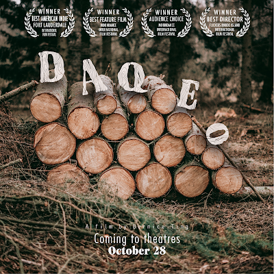
In my second attempt, I took the design further by incorporating additional text and graphics. This approach was inspired by the concept of a movie poster, where the goal is to create a visually appealing and informative composition that not only showcases the font but also conveys the theme of wood.
Final Task 1-Exercise 2: Type and Play
 |
| Figure 8.1.2 Comparison of Extracted and Refined Letters - Week 3 (17/9/2023) |
 |
| Figure 8.1.3 Final Type Design - Week 3 (17/9/2023) |
 |
| Figure 8.1.5 Letter A - Week 3 (17/9/2023) |
 |
| Figure 8.1.6 Letter Q - Week 3 (17/9/2023) |
 |
| Figure 8.1.9 Final Type Showcase Poster Design - Week 3 (17/9/2023) Figure 8.2 Final Type and Play PDF - Week 3 (17/9/2023) |
FEEDBACKS
Week 3:
General Feedback: Focus on the overall shape of the objects rather than simply extracting their outlines to create letterforms. Ensure consistency in each letterform while preserving the characteristics of the objects.
Specific Feedback: Don't extract the words from the gap, use the firewood.
Week 2:
Specific Feedback
1.Axial :Looks a bit off, but still acceptable.
2. Radical: Radical looks good, but they wouldn't know the location is Lecture Theatre 12.
3. Dilatational: Good.
4. Random: The title looks fine, but the details behind it look like you ran out of ideas and just pasted.
5. Grid: Relocate the guests and date details to the right to achieve a more balanced composition, as the left side seems overly weighted.
6. Modular: Modular is good, no issue.
7. Transitional: Transitional looks inconsistent; some are curved, and some are straight."
8. Bilateral: Bilateral with two contrasting colors gives me a bipolar impression, but the arrangement is good.
REFLECTIONS
Experience
I have gained a deeper understanding of typographic systems, an area I had yet to delve into. These systems are the foundational principles that guide designers in achieving consistency and structure in their designs. The Type and Play assignment is more challenging for me compare to the Typographic System. I couldn't visualize how a log wood could incorporate with words but also bring out its characters. Therefore I did a lot of visual research for my second attempt. However, due to the time constraints of just four weeks, both exercises felt rushed.
Observation
I've noticed that the Type and Play assignment offers a plethora of possibilities. The subjects can be complex, leading to even more diverse options for exploration. During the tutorial sessions, I witnessed different perspectives and innovative approaches to refining or creating letterforms that reflect the underlying objects.
Findings
I've discovered a wealth of design possibilities through my exploration of typographic systems. However, I did face challenges generating ideas during the assignment, which led me to spend considerable time contemplating the arrangement and aesthetics. On the other hand, the Type and Play assignment has been an enjoyable experience. It encourages me to be more creative by using inspiration from the world around us, which helps me become more open-minded.
FURTHER READING
 |
| Typographic Systems of Design |
Reference
Elam, K. (2007). Typographic Systems of Design (1st ed.). Princeton Architectural Press.
The book provides me with a solid theoretical foundation for understanding typographic systems. It explains the principles and concepts behind effective typography, which is crucial when designing typographic systems.
 |
| Examples Shown in the Book |
The book likely contains many visual examples showcasing various typographic systems in action. These examples can inspire me by demonstrating how typography can be used creatively to convey information and enhance visual communication. While reading the book, I make notes of any specific ideas or design concepts that stand out to me. I experiment with these ideas in my own design projects and adapt them to suit my creative vision.
 |
| Grid System |
The book covers grid systems, it showcase different grid variations and how they can be manipulated to create unique and innovative layouts.
 |
| Transitional System with Hierarchy |
I learn that understanding typographic hierarchy can lead me to creative experiments in organizing content. I can explore ways to emphasize key information, create focal points, or establish visual flow within my designs.
Learning Outcome
I gained a solid understanding of fundamental typographic principles, including type anatomy, spacing, alignment, and hierarchy. By analyzing case studies and examples, I learned how to approach design challenges strategically and solve them with typographic solutions.






Comments
Post a Comment