15/5/2023 - 26/6/2023 : (Week 7- Week 13)
Ting Wen Yi / 0361799
Typography/Bachelor
of Design (Hons) in Creative Media
Task 3: Type Design and Communication
CONTENT / LINK
LECTURES
Week 7: Task 3 Briefing
-
Conduct research on type design to gather information and gain insights
into the field.
-
Create various sketches exploring different options for your type
design, including variations in sans serif and serif fonts, as well as
uppercase and lowercase letterforms.
-
Compare your sketches to the ten typefaces provided by Mr. Vinod and
identify which one closely matches your desired design. Determine which
of the given typefaces aligns best with your sketches.
-
Analyze and break down the selected references to better understand
their design elements, characteristics, and overall structure. By
deconstructing the references, you can gain valuable insights and
inspiration to refine and develop your own type design further.
 |
| Figure 1.1 Mr. Vinod Demonstrates How to Digitize the Font |
Notes from the Video:
-
Ensure the x-height of the design is 500 points, creating a shape that
measures 500 × 500 points.
-
Make sure the ascender and descender lines remain within the 1000 × 1000
point artboard.
-
If the x-height, ascender, or descender exceeds the specified
measurements, the design needs to be revised accordingly.
-
Implement overshoot in the design for optical and technical reasons.
-
Determine the counter space by maintaining an equal thickness between
the two stems or by making it half the size of a stem.
-
Combine the base shapes using the Pathfinder tool.
INSTRUCTIONS
Task 3 involves designing a set of alphabet letters for a typeface. The
process includes analyzing an existing font, creating sketches, digitizing the
drawings using software, and refining the designs based on feedback. The goal
is to create a typeface with subtlety, presence, legibility, and readability.
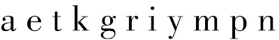
The specific letters to be designed are a e t k g r i y m p n ! # , . Once
completed, a poster showcasing the font will be created.
Task 3: Type Design and Communication
1. Experimenting with Tools
The five tools that I have chosen for this task would be:
- Mildliner Bold Highlighter
- Pentel Touch Brush Pen
- Tombow Brush Pen
- Copic Markers
- Staedtler Pigment Pen
 |
| Figure 2.1.1Writing Tools - Week 7 (16/5/2023) |
Figure 2.1.2 Experimenting in Class - Week 7 (16/5/2023)
Mr. Vinod asked us to bring five different writing tools to class. Here is
what I've done. In addition to traditional writing tools, I decided to
include liquid paper as an experimental tool. Although it is not typically
used for writing, I find it fun and interesting to explore its
possibilities.
Figure 2.1.3 5 Different Tool Stokes and AOTMX - Week 7 (16/5/2023)
After that, we were assigned to use five different tools in five different
ways for each tool, creating writing strokes and AOTMX variations.
Subsequently, we were required to select one option from the five
alternatives for each tool and write "aetkgriympn".

|
|
Figure 2.1.4 5 Different Tool Stokes and AOTMX -
Week 7 (16/5/2023)
|
I have picked out one selection from each tool to write 'aetkgriympn.' I
have chosen the third option to proceed.
2. Research

|
|
Figure 2.2.1 Anatomy of a Typeface - Week 7 (16/5/2023)
|
I started by researching the anatomy of typefaces before starting to
design fonts to familiarize myself with the traditional conventions and
structures of letterforms. This research provides a foundation for
creating fonts that are visually consistent and harmonious with existing
typeface designs.
-
Baseline: It's the imaginary line on which most characters sit,
providing a consistent horizontal reference for the letters.
-
x-Height: This refers to the height of the lowercase letters,
measured from the baseline to the top of the main body of the
lowercase letters (excluding ascenders and descenders).
-
Ascender: The part of a lowercase letter that extends above the
x-height, like the stem of a lowercase "b" or "d."
-
Descender: The part of a lowercase letter that extends below
the baseline, like the tail of a lowercase "g" or "y."
-
Cap Height: This represents the height of the uppercase
letters, measured from the baseline to the top of the capital letters.
-
Stem: It's the main vertical stroke of a letterform, like in
"n" or "h."
-
Serif: The small decorative strokes or lines that appear at the
ends of the main strokes in certain typefaces, like in Times New Roman
or Garamond.
-
Bowl: The curved, enclosed part of a letter, like in "o" or
"b."
-
Counter: The enclosed or partially enclosed space within a
letterform, like in "o," "b," or "a."
-
Ligature: A special character that combines two or more letters
into one connected form, enhancing readability and aesthetics.
Examples include "æ" or "fi."
-
Terminal: The endpoint of a stroke, which can be either flat
(square) or curved.
-
Spine: The curved, central stroke of a letter, like in "S" or
"C."
Counters and Spine
Fully or partially closed spaces found in letters like O, A, and B. If the letter isn't fully closed, then it's an Open Counter.
 |
Figure 2.2.2 Counter and Spine - Week 7 (16/5/2023)
|
Ear and the ShoulderAn Ear is a decorative detail that pokes out from letters like g. A Shoulder is a bumped curve seen in letters like m and n.
 |
| Figure 2.2.3 Ear and the Shoulder - Week 7 (16/5/2023) |
Difference Between Serif and Sans Serif
Serif types feature extended stroke details also known as feet. These details are missing in sans serif styles.
 |
| Figure 2.2.4 Serif and San Serif - Week 7 (16/5/2023) |
Google Fonts

|
Figure 2.2.5 Google Fonts - Week 7 (16/5/2023)
|
Mr. Vinod suggested that we refer to Google Fonts for inspiration. Before I
begin writing my selected options for "aetkgriympn," I took it as a source
of inspiration.
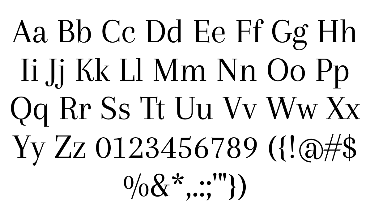
Bodoni Std (Book)
|
|
Figure 2.2.6 Bodoni Std Book Lowercase - Week 8 (24/5/2023)
|
I chose to analyze Bodoni because it closely resembles the font type I
have written.

|
|
Figure 2.2.7 Deconstructed "m,t,k,r" - Bodoni Std Book Reference
- Week 8 (24/5/2023)
|
By deconstructing the letters, I noticed the letterforms in Bodoni Std
Book are characterized by vertical stress, sharp serifs, and crisp
lines. The contrast between thick and thin strokes is pronounced,
contributing to its distinctive look. The terminals are mostly
horizontal or slightly curved.
Didot
|
Figure 2.2.8 Didot Typeface- Week 8 (24/5/2023)
|
I looked for a font that is similar to Bodoni but has a thinner weight.
It can serve as a great source of inspiration for my
project. Like Bodoni, the thinner variant of Didot feature vertical stress,
sharp serifs, and fine lines. The contrast between thick and thin
strokes is still prominent, but the thinner weight gives the typeface a
more delicate and slender look.
3. Sketches
First Attempt

|
|
Figure 2.3.1 First Attempt with Brush Pen - Week 8
(25/5/2023)
|
For my first attempt, I used the selected option to write the
letters. I tried to explore some new fonts, but I found that using my
brush pen to write made it very messy, especially because the tip of the
brush had split.

|
|
Figure 2.3.2 Second Attempt with Outline - Week 8
(25/5/2023)
|
Therefore, for my second attempt, I took inspiration from the first
attempt and used a pen to create an outline for designing a new
typeface.
Third Attempt

|
Figure 2.3.3 Third Attempt Writing - Week 9 (30/5/2023)
|
I realized that I have done it incorrectly. Mr. Vinod wants us to practice
with the chosen tool and write as many words as possible using the letters
"aetkgriympn. I have selected the chosen letter and proceed to
digitize the font.

|
|
Figure 2.3.4 Chosen Letters - Week 9 (30/5/2023)
|
4. Digitize

|
|
Figure 2.4.1 Placing Chosen Letters in Illustrator - Week 9
(30/5/2023)
|
Mr. Vinod instructed us to digitize the letters during the class. I began
by setting the height of each letter at 1000pts and the width at 10000pts
for a total of 10 letters, with each letter occupying 1000pts. I
established guide lines for the ascender, cap, height, baseline, and
descender. However, I intentionally omitted the median line as I intended
to lower it, creating a font with a lower middle line. I positioned the
selected letters and placed them at the back.

|
Figure 2.4.2 Using Shape Tool - Week 9 (30/5/2023)
|
For my font design, I discovered that utilizing the shape tool is the most
effective method for replicating my sketch.

|
|
Figure 2.4.3 Attempt 1 Done - Week 9 (30/5/2023)
|
After creating all the given letters, I duplicated them twice in order to
further refine the design.

|
|
Figure 2.4.4 Digitize Development - Week 9 (31/5/2023)
|
For the first design, I start by replicating the handwritten letter. Then,
I refine the sharp edges and make the font rounder with no sharp corners.
The overall visual impression becomes softer and more harmonious. This
modification can contribute to a more friendly and approachable appearance
of the font. In the third attempt, it's quite similar to the first, but I
incorporate slant angles at the bottom of the letters. For some letters, I
also add slant angles at the top. This can enhance the dynamic and
energetic aspect of the font.

|
|
Figure 2.4.5 All Digitize Letters - Week 9 (31/5/2023)
|

|
Figure 2.4.6 Before & After Amendment - Week 10
(6/6/2023)
|
Based on Mr. Vinod's suggestion, I have made the necessary adjustments
to the tail by using the Pathfinder tool to create a less pointy shape.

|
Figure 2.4.7 Letter "Y" - Week 10 (6/6/2023)
|
I realized that I had missed out the letter "Y," so I proceeded to
design the missing letter.
Designing Punctuations

|
Figure 2.4.8 Exclamation Mark - Week 10 (7/6/2023)
|
In order to keep the style consistent with my letters, I have designed the
exclamation mark in a similar fashion. I made five different attempts to
explore different designs and ultimately chose the #6 design as the most
suitable option.

|
|
Figure 2.4.9 Illustrator Designing Punctuations - Week 10
(7/6/2023)
|
To maintain consistency, I have transformed the full stop into a square
shape and added a slanted angle to the pound sign (#). Additionally, I
have designed the comma with a combination of square and slanted pointy
angles.
Measurements (from baseline)
Ascender: 750 pt
Cap: 700 pt
Capital height: 500 pt
Median: 200 pt
Baseline: 0 pt
Descender: -250 pt

|
Figure 2.4.10 All Letters and Punctuations - Week 10 (7/6/2023)
|
Refining

|
|
Figure 2.4.11 Before & After Refining - Week 11
(13/6/2023)
|
After receiving feedback from Mr. Vinod, I made some punctuation
refinements. I changed the tail of the comma, increased the size of
the full stop (period), and made the top of the exclamation mark wider
and the bottom narrower.
 |
Figure 2.4.12 Refining Process - Week 11 (13/6/2023)
|

|
|
Figure 2.4.13 Finalize Letters and Punctuations - Week 11
(13/6/2023)
|
I have also removed the slated angles from the hashtag.
5. FontLab

|
Figure 2.5.1 Placing Letters in FontLab 7 - Week 10
(10/6/2023)
|
After finalizing the design of my typeface in Illustrator, I used FontLab
to develop and export my font. To guide me through the process, I followed
a demo video by Mr. Vinod that explained how to develop and export fonts
using FontLab7.

|
Figure 2.5.2 Letter kerning in FontLab 7 - Week 10
(10/6/2023)
|
|
I followed the process of pasting all the letters into FontLab7 and
performed individual kerning adjustments for each glyph in the metrics
tab, similar to what was demonstrated in the demo video.

|
|
Figure 2.5.3 Kerning for Every Letters and Punctuations - Week 11
(13/6/2023)
|
I performed kerning adjustments for all the existing letters, such as the
letter "K," to ensure proper spacing between them. I extended this process
to include all the letters and punctuation marks, improving their overall
appearance when placed next to each other.

|
|
Figure 2.5.4 Letter kerning in FontLab 7 - Week 11 (13/6/2023)
|
6. Poster

|
Figure 2.6.1 First Poster Design - Week 11 (15/6/2023)
|
I created two posters using the available letters. For the first poster,
I aimed for a clean and slightly dynamic design. I left-aligned the words
in the first and third rows, while keeping the second and fourth rows
slightly centered. I also kept the background white and simple.

|
Figure 2.6.2 Second Poster Design - Week 11 (15/6/2023
|
For the second poster, I wanted to create something with a black
background. I changed the wording to "TYPE KING, IGNITE MY PRIME." All the
words are left-aligned.
Final Outcome

|
Figure 3.1 Final Poster Design - Week 12 (20/6/2023)
|
After the feedback session, Mr. Vinod said that the second poster does not
have an impact, so I decided to go with the first poster. Mr. Vinod said we
should include every letter; therefore, I have added "ginger". He also
suggested that I should make the font bigger, and for the font details, make
it vertical.
Final Task 3: Type Design & Communication

|
|
Figure 4.1 Final Task 3: Type Design and Communication (JPEG)
- Week 12 (20/6/2023)
|
Figure 4.2 Final Task 3: Type Design and Communication (PDF) - Week 12
(20/6/2023)

|
|
Figure 4.3 Screenshot of "New Metrics Window" with
Sentence - Week 12 (20/6/2023)
|

|
Figure 4.3 Final Poster Design (JPEG) - Week 12 (20/6/2023)
|
Figure 4.4 Final Poster Design (PDF) - Week 12 (20/6/2023)
Type Playground
You can type characters from the following set: "AETKGRIYPMN.,!#".
Figure 4.5 Type Playground - Week 12 (20/6/2023)
FEEDBACKS
Week 8 (ILW)
Specific Feedback: Proceed with the third one. Explore writing
that style a few more times.
Week 9
General Feedback: Follow the step-by-step procedures for the
writing activity and avoid skipping directly to the five selected
options without first writing out five styles using five different
tools.
Specific Feedback : Decide whether you want to be rigid with
your font or make it smoother.
Week 10
Specific Feedback: The first and third options are fine. However, for the third option, make
the tail not excessively pointed.
Week 11
Specific Feedback: The exclamation mark should be wider at the
top and narrow at the bottom. The dot of the exclamation mark should be
the same shape as a full stop. The comma looks a bit strange; maybe
could straighten the tail. The full stop should be bigger.
Week 12
General Feedback: The subtitle use only Helvetica or Arial,
the point size should be 12pt.
Specific Feedback: For poster 1, use only the regular font style of Helvetica font and and
increase the font size. Align the subtitle with the title. For poster 2, a
white background would be preferable.
REFLECTIONS
Experience
Through this task, I have gained valuable
experience in creating my own typeface using software tools like
Illustrator and FontLab. Despite having limited prior knowledge in
typeface design, I learned and applied the necessary skills to create
a typeface from scratch. I started by experimenting with different
writing tools on paper to explore various shapes and styles.
Transferring these writings to Illustrator allowed me to make precise
adjustments and fine-tune the designs as I manipulated shapes, curves,
and spacing. This exercise deepened my understanding of the technical
aspects of type design, and now I feel confident in my ability to
create my own typeface and publish it to the public.
Observation
Throughout the task, I observed the intricacies and complexities
involved in creating a well-designed typeface. I noticed how small
adjustments to the curves and proportions of each letter greatly
influenced the overall appearance and legibility of the font. It
became evident that even minor modifications could have a significant
impact on the readability and aesthetic appeal of the typeface.
Findings
Through this task, I discovered that typeface design is a meticulous
and iterative process that demands attention to detail and a keen eye
for aesthetics. It requires a balance between artistic expression and
technical precision. The software tools I used, Illustrator and
FontLab, proved to be essential in facilitating the design and
production of the typeface, providing me with the necessary features
and functionalities.
FURTHER READING

|
|
Figure 4.1 Typography, Referenced: A Comprehensive Visual Guide
to the Language, History, and Practice of Typography
|
Reference:
Author: Kathryn Henderson, Allan Haley, Ina Saltz, Jason Tselentis,
Richard Poulin, Gerry Leonidas, Tony Seddon, Tyler Alterman
Published: February 1, 2012 by Rockport Publishers
Chapter 3: Type Design and Development

|
|
Figure 4.2 Sketch Development
|
The Language of Letters
Typeface design, type design, and font design are terms often used
interchangeably, but they have nuanced differences. Letterforms refer to
manually created representations of letters, while typeforms are
representations intended for mechanical reproduction. Typeforms focus on
formal relationships in two dimensions, independent of specific rendering
technologies. Typeface design captures the designer's intentions for a
collection of typeforms. Typeforms are then converted into glyphs, precise
encodings enriched with information about spacing, relationships, and
behavior. The machine-specific implementation of a typeface is known as a
font. Typeface design and font making are typically sequential processes,
although they can be closely intertwined, with separate individuals or
team members fulfilling these roles.
Tools and Concept

|
|
Figure 4.3 Card Template Cut by Jim Rimmerr for His Typeface
Stern
|
Typeforms in typeface design are closely tied to various forms of writing,
ranging from graffiti to simple signs and elaborate public lettering. These
writing forms establish the fundamental relationships between strokes and
the empty space surrounding them, forming the core of typeface design.
Building upon this foundation, the designer brings their interpretation and
elaboration, creating unique combinations of typeforms with a consistent
texture and incorporating stylistic elements. Even in highly constructed
typefaces, there is a subtle hint of the rhythmic nature of manual
mark-making.
From a Letter to a Typeface

|
|
Figure 4.4 Four Stages of Early Development
|
Designing a full alphabet for a typeface is a complex task that goes beyond
designing individual letters. The designer needs to strike a balance between
complementary and contrasting features across a large character set. The
goal is to ensure that the range of shapes combines harmoniously to create a
unified whole. This underlying homogeneity distinguishes typefaces from
lettering. While maintaining readability as a priority, the designer can
incorporate unique features that give the typeface personality and style.
The integration of these features within a cohesive design allows for the
creation of a new typeface that is both visually appealing and functional.
Design by Team

|
|
Figure 4.5 Text Generator
|
Typeface design has experienced a shift towards a team-based approach,
harnessing the collective expertise of a group rather than relying solely
on individual designers. While this collaborative approach may seem novel,
it has historical roots as typeface design during the hot-metal and
phototype eras often involved teamwork. The advent of digital platforms
and platform-independent formats has allowed designers to break free from
the constraints of heavy engineering and work as independent
practitioners. This, in turn, has led to an explosion of character sets
and typeface families on an unprecedented scale.

|
|
Figure 4.6 Development of Mitja Miklavčič’s Tisa
|
The complexity and scope of designing text and branding typefaces have
necessitated the growth of mid-size foundries, where designers with
complementary skills come together to collaborate on a single typeface. By
combining their expertise, these teams can tackle the intricate work and
demanding requirements of creating typefaces for textual and branding
purposes. However, with this rise in collaborative design, there is also
an increased need for comprehensive documentation and explanation to
effectively communicate with fellow designers in the community.
The traditional notion of the solitary "creative hermit" working in
isolation is gradually being replaced by new work modes that embrace
collaboration and teamwork. The recognition of the benefits derived from
pooling diverse skills and perspectives has reshaped the landscape of
typeface design, fostering a more collective and inclusive approach to
creating typography.
Rendering Environment

|
|
Figure 4.7 Original Outline vs Laser Printer
|
The rendering environment, or the way typefaces are displayed in design
applications, plays a crucial role in connecting the appearance of
paragraphs with specific design choices. Design applications often allow
designers to zoom in on details, but this prevents the display of an
entire paragraph. On the other hand, zooming out to show multiple lines of
text can result in low resolution, making it difficult to assess fine
details.
Printouts, while another option, are not always reliable due to various
factors such as Postscript version, toner level, paper quality, and
orientation, all of which can affect the quality of the printed output.
Some type designers address this by obtaining printouts from different
printers. They may even insert lines of type in the margins of print jobs
or include small advertisements in their own typeface to assess how the
typeface performs under offset conditions. It is worth noting that process
black is generally lighter than laser toner, which can result in a
washed-out appearance for a typeface in offset printing.
Space Matters
|
|
Figure 4.8 Detail from the Encyclopedie of 1754 Shows
Composed Foundry Type
|
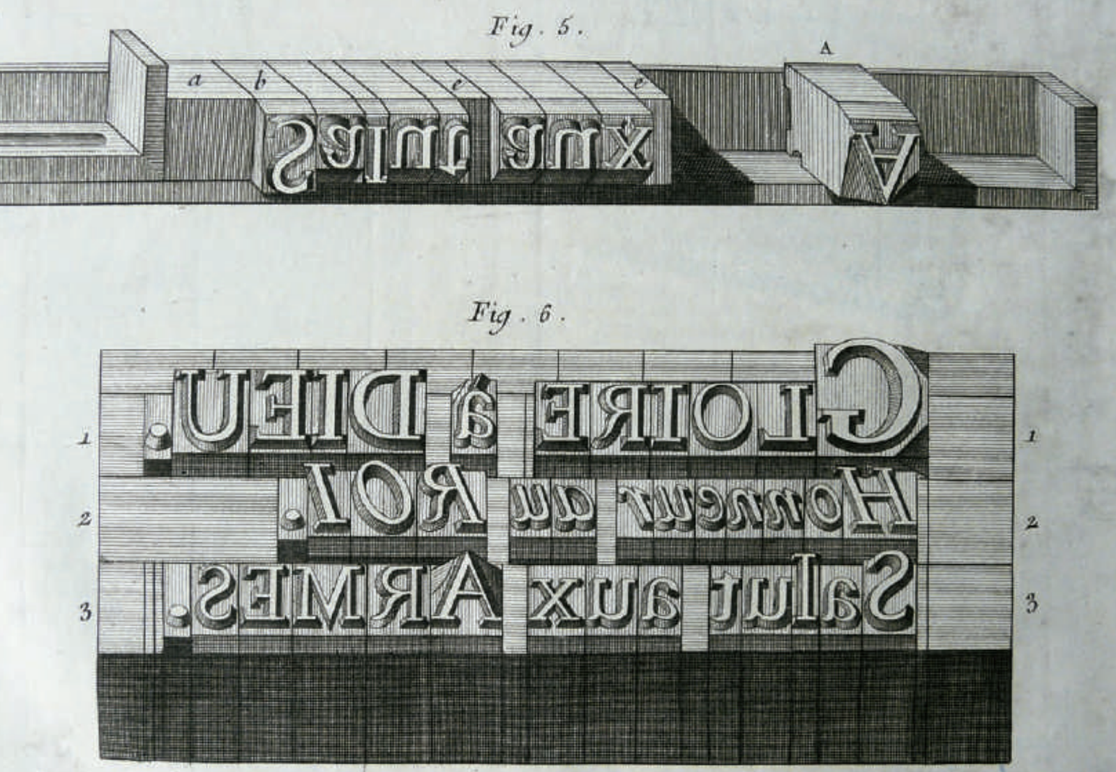
Punchcutters and letter cutters have long understood the significance of
spacing in a typeface. They know that the space between letters is a
critical element that greatly impacts the overall design. Interestingly,
readers may not be able to accurately identify specific widths along a
line of text, but they are highly adept at detecting inconsistencies in
spacing.
Within just a few words, a designer can establish the fundamental rhythm
of a typeface. By making small adjustments to the basic dimensions and
spacing, a typeface can appear normal or create the impression of a wider
or narrower variant. This fundamental pattern has a significant impact on
the readability of the typeface, even more so than the intricate details
of the actual letterforms themselves.
Character Expansion

|
|
Figure 4.9 Three Typeforms from the Markant Typeface
|
The demand for typefaces with extended character sets has been steadily
increasing due to various factors. Operating systems and application
interfaces need to be capable of displaying multiple languages, leading to
a need for larger typeface character sets. Additionally, the
internationalization of publications and branding for products and
services further drives the requirement for extended character sets in
typefaces.
Today, custom typefaces for big brands often encompass several thousand
characters and span multiple scripts. Typefaces bundled with operating
systems and applications, as well as custom typefaces for brands, are
expected to cover more than one script, with a minimum requirement
typically including Cyrillic, Greek, and extended Latin scripts.
Furthermore, character sets are increasingly expanding to include Arabic,
Hebrew, and Indian scripts.
Learning Outcome:
After studying this section on type design and development, I am able to:
-
Understand the distinction between letterforms, typeforms, and
typefaces, and how they relate to each other in the context of
mechanical reproduction.
-
Recognize the importance of space and spacing in typeface design and
how it impacts readability and overall design.
-
Explain the process of designing a full alphabet for a typeface,
considering complementary and contrasting features across a large
character set.
-
Describe the shift towards team-based typeface design, the growth of
mid-size foundries, and the need for collaboration and documentation
in creating comprehensive typeface families.
-
Identify the challenges and considerations in the rendering
environment, including the display of type in design applications and
the impact of different printing technologies.
-
Appreciate the increasing demand for typefaces with extended character
sets to accommodate multiple languages and international branding.
-
Understand the historical roots of typeface design and the evolution
of work modes, moving away from the solitary designer towards
collaborative and inclusive approaches.
-
Recognize the importance of spacing in typeface design and its impact
on the overall visual rhythm and readability of a typeface.


Comments
Post a Comment