In this exercise task, we were given seven words and asked to choose four to compose and express: rain, fire, crush, water, dissipate, freedom, and sick. We were limited to a set of 10 typefaces to work with in the digitization phase, which included Adobe Caslon Pro, Bembo, Bodoni, Futura, Gill Sans, ITC Garamond, ITC New Baskerville, Janson, Serifa, and Univers. Our task was to choose a typeface that complements our chosen idea and digitize our sketch, considering the size and placement of the text.
1. Sketches
 |
Figure 7.1.1 Hand Sketch - Week 2 (12/4/2023)
|
Mr. Vinod suggested that we should create a hand-sketch before digitizing the picture. Therefore, I am providing this sketch.
 |
| Figure 7.1.2 Type Expression Sketch - Week 1 (6/4/2023) |
I began by sketching out ideas for each word. The four words I have chosen to compose and express are sick, freedom, dissipate, and rain. I created rough sketches for each word using Procreate. Each sketch includes a small explanation of concept.
 |
| Figure 7.1.3 Crush Type Expression Sketch - Week 1 (6/4/2023) |
After creating sketches for four different words, I decided to create one additional sketch just in case any of the previous sketches were rejected by the lecturer. I created four more sketches, similar to the previous ones. I ultimately chose the word 'crush' and wrote a brief description below the sketch.
2. Digitization
Freedom
 |
| Figure 7.2.1 "Freedom" Digitalization Progress, Week 2 (12/4/2023) |
As I revise my work, I am also developing new and improved ideas. I have come up with an idea to use the letter "o" as a keyhole, symbolizing the idea of unlocking and opening up new possibilities, and implying the sense of freedom that comes with it. In the second design, the letter "m" is depicted as flying away like a bird, conveying the impression of freedom.
Crush
 |
| Figure 7.2.2 "Crush" Digitalization Progress, Week 2 (12/4/2023) |
Instead of incorporating graphical elements, I enlarged the letter "C" in the design, causing the other letters to be pushed towards the corner, creating the impression of being "crushed.
Rain |
Figure 7.2.3 "Rain" Digitalization Progress, Week 2 (12/4/2023)
I used multiple 'i's to represent raindrops. Each 'i' was carefully placed to mimic the random patterns of a rain shower. I chose to use this approach because it allowed me to create a sense of movement and fluidity in the design. |
Sick |
| Figure 7.2.4 "Sick" Digitalization Progress, Week 2 (12/4/2023) |
For the first design, the letter "i" is design as a thermometer, I inverted letter "i" and add different length of lines to look like calibration. In the second design, the letter "i" is shaped like a bed, emphasizing the meaning of being sick.
Dissipate  |
Figure 7.2.5 "Dissipate" Digitalization Progress, Week 2 (12/4/2023)
For the first design, the words gradually fade away, implying the meaning of dissipate. In the second design, the words are blurred out. Personally, I prefer the first design. |
.jpg) |
Figure 7.2.6 Digitalized Type Expressions, Week 2 (12/4/2023)
|
 |
Figure 7.2.7 Digitalized Type Expressions, Week 2 (12/4/2023)
|
For this week, I did two attempts for some of the words so that I can seek advise from my lecturer which version is better and I want to avoid any similar designs with my classmates.
.png) |
Figure 7.2.8 Revised Type Expressions, Week 3 (18/4/2023)
|
After receiving feedback from Mr. Vinod, I have revised my work. I enlarged the word "sick" and for "freedom, I made the width of the words the same length as the frame by enlarging the font size and leaving out a space for the letter "m". The letter "m" appears to be flying up into the sky like a bird. Mr. Vinod suggested that all the letters in "crush" should be in the same font to create a better impact. As such, I have changed the font for the word "rain" to make it more rounded and puffy, looking more like a cloud. For the raindrops, I have changed the typeface to Univers LT Std, which appears more condensed and thin like a raindrop. I didn't choose "dissipate" because a lot of classmates are sharing the same idea with me and I don't think it's bold and creative enough.
Final Type Expressions
 |
| Figure 7.2.9 Final Type Expressions JPEG, Week 3 (18/4/2023) |
Figure 7.2.10 Final Type Expressions PDF, Week 3 (18/4/2023)
3. Type Expression Animation
Mr. Vinod taught us how to do some basic type animation by using Illustrator and Photoshop. I tried out two different words to see which one represent best through animation.
Final Type Expressions Animation
 |
| Figure 7.3.5 Final Animated Type Expression "Crush" GIF, Week 4 (25/4/2023) |
Task 1: Exercise 2 - Text Formatting
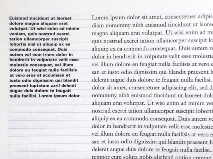
In this exercise, we are given incremental amounts of text that address different areas within text formatting, i.e., type choice, type size, leading, line-length, paragraph spacing, forced-line-break, alignment, kerning, widows and orphans, and cross-alignment. These minor exercises (Formatting Text 1:4 to 4:4A) will increase our familiarity and capability with the appropriate software and develop our knowledge of information hierarchy and spatial arrangement.
1. Text Formatting Exercise Based On Lecture
 |
| Figure 8.1 Text Formatting Exercise - Week 4 (28/4/2023) |
Lecture Notes:
- Use the same paragraph spacing as the leading.
- Consistency in text width is crucial to avoid confusing the audience as it makes them think the text is a separate piece of information.
- Prefer left alignment, but left justify may be used if it doesn't create rivers, which are large awkward spaces between words.
- To minimize ragging or uneven line spacing, limit tracking adjustments to a range of +3/-3.
- Increase heading leading by 2 points (2.5 or 3 for typeface).
- For optimal readability, keep the line length between 55 to 65 characters for body text and 35 characters for subtext.
- Body text should aim for equal negative and positive space to achieve a middle gray value.
- Turn off hyphenation unless it's necessary. If it's turned on, ensure that there aren't too many hyphens or make tracking adjustments.
- Double the point size and use the leading of the body text for headings.
- Maintain cross alignment to ensure consistency throughout the text.
- Avoid widows, which are a single word on a line by itself at the end of a paragraph, and orphans, which are a single word on a line by itself at the beginning of a paragraph.
2. Compositions & Layouts
Figure 8.2.1 Layout Composition Draft - Week 4 (28/4/2023)
I create drafts of compositions before attempting layouts. I use dark gray for images and light gray for text.
 |
Figure 8.2.2 Layout #1 - Week 4 (28/4/2023)
|
Fonts: ITC New Baskerville Std, Bold (Heading), ITC New Baskerville Std, Roman (Subheading), Adobe Caslon Pro, Regular (Body)
Point size: 36 pt (Heading), 11 pt (Subheading, Body)
Leading: 13 pt (Body)
Tracking: -10
Line Length: 56
Paragraph spacing: 13 pt
Alignment: Left align justify
 |
| Figure 8.2.3 Layout #2 - Week 4 (28/4/2023) |
Fonts: Futura Std, Bold (Heading), ITC New Baskerville Std, Roman (Subheading), ITC Garamond Std, Light Narrow (Body)
Point size: 30 pt (Heading), 11 pt (Subheading, Body)
Leading: 13 pt (Body)
Tracking: -10
Line Length: 65
Paragraph spacing: 13 pt
Alignment: Left align justify
 |
| Figure 8.2.4 Layout #3 - Week 4 (28/4/2023) |
Fonts: Futura Std, Bold Condensed (Heading), Futura Std, Book (Subheading), Adobe Caslon Pro, Regular (Body)
Point size: 60 pt (Heading), 12 pt (Subheading), 10 pt (Body)
Leading: 12 pt (Body)
Tracking: -5
Line Length: 56
Paragraph spacing: 12 pt
Alignment: Left align justify
 |
| Figure 8.2.5 Layout #4 - Week 4 (28/4/2023)
|
Fonts: Futura Std, Bold (Heading), ITC New Baskerville Std, Roman (Subheading), Adobe Caslon Pro, Regular (Body)
Point size: 60 pt (Heading), 10 pt (Subheading), 8 pt (Body)
Leading: 51(Heading), 10 pt (Body)
Tracking: -10
Line Length: 55
Paragraph spacing: 10 pt
Alignment: Left align justify
 |
| Figure 8.2.6 Layout #5 - Week 4 (28/4/2023) |
Fonts: Futura Std, Bold (Heading), ITC New Baskerville Std, Roman (Subheading), Adobe Caslon Pro, Regular (Body) Point size: 104 pt, 47 pt (Heading), 14 pt (Subheading), 10 pt (Body) Leading: 12 pt (Body) Tracking: -10 Line Length: 60 Paragraph spacing: 12 pt Alignment: Left align justify
 | | Figure 8.2.7 Layout #6 - Week 4 (28/4/2023) |
|
Fonts: Futura Std, Bold (Heading), ITC New Baskerville Std, Roman (Subheading), Adobe Caslon Pro, Regular (Body) Point size: 60 pt (Heading), 11 pt (Subheading), 11 pt (Body) Leading: 13 pt (Body) Tracking: -10 Line Length: 60 Paragraph spacing: 13 pt Alignment: Left align justify |
I prefer using left justify throughout the layout because I like the clean and aligned appearance it provides.
 |
| Figure 8.2.8 Before & After Using Baseline Grid - Week 4 (29/8/2023) |
After applying alignment to the baseline grid, the text creates a consistent and organized appearance, making it easier for readers to follow along and read. It also ensures there is a consistent amount of space between lines of text, which can enhance the readability and overall comfort of the text.
 |
Figure 8.2.9 Before & After Resize Abbreviation - Week 5 (3/5/2023)
|
I reduce the font size by 1pt to avoid disrupting the reading rhythm caused by abbreviations.
Final Text Formatting Layout
Head
Font/s: Futura Std, Bold
Type Size/s: 60 pt
Leading: 48 pt
Paragraph spacing: 0
Subhead
Font/s: ITC New Baskerville Std, Roman
Type Size/s: 11 pt
Leading: 0
Paragraph spacing: 0
Body
Font/s: Adobe Caslon Pro, Regular
Type Size/s: 11 pt (10pt only for abbreviation)
Leading: 13 pt
Paragraph spacing: 13 pt
Characters per-line: 52
Tracking:-10
Alignment: left justified
Margins: 54 mm top, 18 mm bottom, 15 mm left & right
Columns: 2
Gutter: 10 mm
 |
| Figure 8.3.1 Final Text Formatting Layout JPG, Week 5 (3/5/2023) |
Figure 8.3.2 Final Text Formatting Layout PDF, Week 5 (3/5/2023)
 |
Figure 8.3.3 Final Text Formatting Layout (Grids) JPG, Week 5 (3/5/2023)
|
Figure 8.3.4 Final Text Formatting Layout (Grids) PDF, Week 5 (3/5/2023)
FEEDBACKS
Week 2:
General Feedback: Sketch before digitalize, don't use any typeface and avoid any distortions.
Specific Feedback: Go one step back and sketch first, but the digitalize version can put in portfolio.
- Freedom: it's a good idea to make the letter 'm' look like a bird, but not exactly like a bird, and be careful not to distort the letter 'm'.
- Dissipate: second and third idea is workable
- Rain: third design of word "rain" is good
- Sick: the letter 'I' can be designed like a thermometer, with added lines to resemble calibrations.
- Crush: the letter 'C' can cover 'rush', and the letters 'rush' can be placed with hierarchy, going up and down.
Week 3:
1. Do the expressions match the meaning of the words?
2. Are the expression well crafted (crafting/lines/shapes)?
2a. Do they sit well on the art-board
2b. Are the composition engaging? Impactful?
3. Are there unnecessary non-objective elements present?
4. How can the work be improved?
General feedback: make use of the frame, fonts can be bigger
Specific Feedback:
- Freedom: make the word large sits at the bottom of the frame, and letter "m" on top.
- Dissipate: #1 is good.
- Rain: make "rain" look more like a cloud. Use a different typeface, and use a narrow font for the letter "i."
- Sick: make use of the space given, make the word larger. #2 is much more in placement.
- Crush: use the same typeface and font for the letters "rush" as the letter "C" to create consistency.
Week 4:
General Feedback: When creating animation is better to pause at the end.
Specific Feedback:
Rain: The word rain don't contract and expand too much or don't move at all.
Crush: Pause/stop at the back-add two to three frame.
Portfolio feedback : Change the background to grey and the outer area to .
Week 5:
1. Is kerning and tracking appropriately done?
2. Does the font size correspond to the line-length, leading & paragraph spacing
3. Is the alignment choice conducive to reading?
4. Has the ragging been controlled well?
5. Has cross-alignment been established using base-line grids?
6. Are widows and orphans present?
General Feedback: Reduce the font size for abbreviation.
Specific Feedback:
- Proceed with Layout 6. Left justify spacing minimum 7mm in the middle.
- Choose a picture that is relevant to the title.
- Picture too close - same spacing as paragraph spacing.
REFLECTIONS
Experience
Doing the first exercise is quite challenging because we can't use graphical elements and need to rely solely on words to express the meaning. During the sketching process, I found it challenging to come up with many ideas and be creative. However, this exercise helped me become more familiar with Adobe Illustrator and learn the basics of animation through Photoshop. For the second exercise, it was daunting although it looks like it's a simple task of arranging a layout, but it has many rules. But through the lecture video, it helped me to understand better. I am also grateful for the feedback session, as it exposed me to different ways of thinking and helped me learn how to improve my work thanks to Mr. Vinod.
Observation
I've observe that typography is a step by step process and it has helped me understand its importance in creating effective visual communication. It involves brainstorming ideas and sketching them out before digitizing them. This process not only helps me to refine my ideas and make them more concrete but also allows me to experiment with different typefaces and layouts before settling on the final design. By taking the time to work through this process, I can create more thoughtful and effective designs that communicate my message clearly and effectively.
Findings
I have learned how to use the appropriate typeface based on the given 10 typefaces (Adobe Caslon Pro, Bembo, Bodoni, Futura, Gill Sans, ITC Garamond, ITC New Baskerville, Janson, Serifa, and Univers).I also learned that good layout and formatting can make the user, or reader, easy to read. Typography is key to every detail and has many rules and much knowledge to learn. The exercise I did is only the tip of the iceberg.
FURTHER READING
 |
| Lettering and Type: Creating Letters and Designing Typefaces (2009) |
Reference: Library of Congress Cataloging-in-Publication Data
Willen, Bruce, 1981-
Lettering & type : creating letters and designing typefaces / Bruce Willen
and Nolen Strals ; with a foreword by Ellen Lupton. — 1st ed
Chapter 1: Context
.png) |
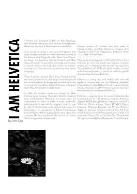
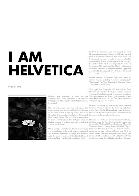
Helvetica
|
Lettering and typography balance functionality, legibility, and context with the creative vision of the designer. Legibility is essential for recognizable letterforms, but the acceptable level of legibility can vary depending on the context. In some cases, less legible letterforms may be intentionally used to convey a specific visual or intellectual tone, inviting the viewer to actively engage with the shapes of the letters.
Chapter 2: Systems & Type-ologies
.png) |
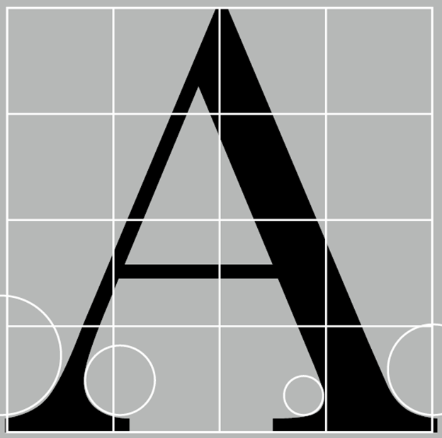
| Example of Letter Structure |
Lettering and type classification systems were first devised in the 19th century by printers and type historians to categorize the increasing number of type styles. These categories generally correspond to periods of art and intellectual history, but different foundries and scholars have used different labels, leading to ongoing disagreement. However, the specific terms of classification are less important than the shared attributes and systems they represent. Categories of lettering and type provide a starting point for discussing and analyzing typographic systems, but they are not absolute and many lettering examples defy neat classification. As experimentation continues, letterers and type designers are not constrained by traditional type categories.
Chapter 3: Creating Letters
.png) |
| The Lettering Process |
The lettering process often involves multiple rounds of sketching and refinement to create a set of letters that stay true to the designer's hand. Sketches may start as thumbnails or rough digital layouts and progress to more polished versions. This process can be slow and meticulous, with each step taking hours, days, or even weeks to complete. Designers and letterers carefully scrutinize each letter's shape and its relationship to the overall system to ensure that the final result is purposeful and cohesive.
Chapter 4: Making Letters Works
Control characters, such as "n," "o," "H," and "O," are used as starting points to establish the stroke weight, width, x-height, axis, and other physical characteristics of a typeface. Combining letters into words and sequences is a critical test to ensure they look good together and may require adjustments to the entire system.
.png) |
| Example of Letterform Analysis |
The diagrams in Lettering & Type illustrate basic principles and nuances of constructing each letter of the alphabet, focusing on a transitional sans serif typeface like Franklin Gothic. Letters do not exist in isolation, and designers often compare and learn from precedent to understand the principles and idiosyncrasies of any typeface's system. Lowercase letters are typically prioritized in text typefaces, as they are used more frequently. Decisions about x-height, ascenders, descenders, serif size, character width, counter space, crossbar placement, and curve shape greatly impact a font's overall feel, legibility, and usefulness. Accurate spacing and side bearings are crucial for the lowercase alphabet, as it does not tolerate increased letterspacing well.
Learning Outcome
I have learned the process of designing my own typefaces, from initial sketches to digitizing and refining letterforms. I have gained an understanding of the technical aspects of creating a complete character set, including uppercase and lowercase letters, numerals, punctuation, and special characters, resulting in unique and functional typefaces. I have also learned how to create typographic hierarchy by understanding the visual weight, size, and spacing of letterforms. This has allowed me to effectively communicate messages and create emphasis in my designs through the strategic use of type, especially in branding and editorial design projects.


.jpg)

.png)


.png)

.png)


.png)
.png)
.png)
.png)


Comments
Post a Comment