Environment Design - Project 1 : Exterior and Landscape Design

Ting Wen Yi / 0361799
Environment Design/Bachelor of Design (Hons) in Creative Media
Project 1 : Exterior and Landscape Design
INSTRCTIONS
You are to choose and develop a location e.g. Temple set, Ruins, Village, City etc based on a theme or story that you have proposed from a game/movie/cartoon. Below is the list of tasks to be completed.
- Mood board – collection of references and breakdown
- Thumbnail sketches – initial concept ideas
- Composition studies – 5 drawings, best communicate visually
- Value studies – Continue from 5 compositions
- Ambience studies – Continue from 5 value painting
Submission:
Complete Call-out Sheet. Note that each progression to be drawn on 2000 X 3000 pixels 150 dpi 16:9 ratio landscape for weekly progression. Remember this is the pre-production stage where you must make it about 70% min completion that visually communicates and appeals to target audiences.
PROJECT 1 : EXTERIOR AND LANDSCAPE DESIGN
Week 1 - Game Chosen
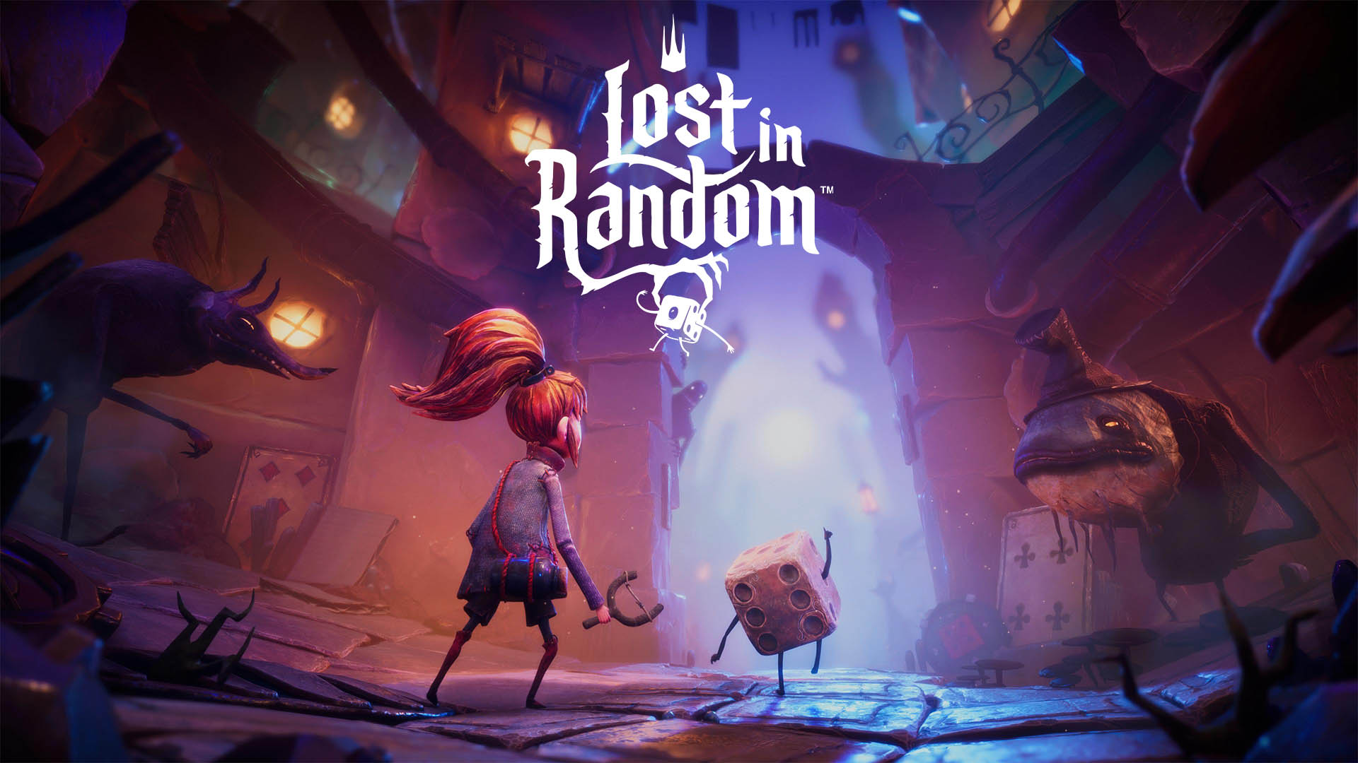
I've decided to work on Lost in Random, a game known for its dark, whimsical art style. The game already has a unique visual vibe, blending gothic and surreal elements, but for this project, I want to take it a step further. My goal is to give it a bit more polish by making the style feel more 3D, while still keeping that eerie, dreamlike atmosphere.
 | |
|
Lost in Random is an action-adventure game developed by Zoink and published by Electronic Arts. The game is set in a dark, fantastical world governed by chance, where every aspect of life is determined by the roll of a die. It follows the story of Even, a young girl who embarks on a quest to rescue her sister, Odd, from the clutches of a wicked queen who controls the land of Random.
The art style of Lost in Random is heavily inspired by Tim Burton's gothic and eerie aesthetics. The environments are quirky, whimsical, and dark, with a blend of fantasy and dystopian elements. Characters and settings are often asymmetrical, with exaggerated features, contributing to the game’s twisted fairy-tale atmosphere. The world is divided into six different realms, each representing a number on a six-sided die, with unique themes for each zone.
 | |
|
Proposed Art Style Improvements
I'm aiming to improve the art style by adding more depth and dimension to both the characters and the environments, so it feels richer.
1. Location & Setting
In Lost in Random, Fourburg is all about class differences and chaotic city design. I’m looking to bring in some Art Nouveau elements to make it feel more grand and stylish. The marketplaces will be colorful but a little chaotic, with vendors selling everything from fancy luxury items to basic necessities, highlighting the gap between the rich and the working class. I also want to emphasize the city’s verticality with tall, intricate buildings that show off both the wealth and the wear and tear of the place.
2. Culture & Time
Fourburg’s culture is shaped by the divide between the rich and the working class. By adding Art Nouveau-inspired architecture, the design will reflect a city that used to be luxurious but has become a bit messy and uneven. The rich areas will have polished, ornate buildings, while the working-class neighborhoods will feel more cluttered and worn down. I’ll stick with the game’s twilight or overcast atmosphere but enhance the lighting to make these contrasts more striking and bring more depth to the setting.
3. Audience
The design improvements will cater to the duality of Fourburg’s society, divided between the rich and the working class. By creating grand environment with vibrant colors and intricate Art Nouveau designs, the world will feel more alive, emphasizing both the wealth and struggle of its citizens. This updated environment will mirror the daily tension between luxury and survival, reflecting the cultural and economic disparities within the city.
4. Structures
The quirky, exaggerated style of Fourburg will stay, but I’ll be adding more Art Nouveau influences. The wealthier areas will have taller, more detailed buildings with organic form designs, while the working-class areas will feel more chaotic and cramped. I’ll use bright colors in key spots to highlight the differences, but still keep the dark, eerie vibe that Lost in Random is known for.
5. Color Scheme
The original game has a pretty muted, dark palette, which I’ll stick with, but I’ll add a few brighter tones in key areas to create contrast. This will help the important objects or characters stand out more and make the world feel more layered.
My current mood board draws inspiration from Little Nightmares 2 and Unravel Two, showcasing a blend of 3D graphics and higher resolution details.
 | |
|
- Observe deeper into the game’s current art direction and key elements to find areas where I can make improvements without losing the heart of what makes Lost in Random unique.
- Use more advanced 3D modeling techniques to give the characters and environments more depth, making sure the game’s signature hand-painted textures and oddball designs stay intact.
Current Game Design
 |
| Figure 1.4 Current Design Mood Board - Week 1 (28/9/2024) |
- Different realm themes have its own distinct look.
- Buildings can have quirky shapes and slanted roofs, with mismatched windows and doors.
- Use a mix of dark and muted colors.
- Dark, muted colors with occasional bright contrasts (like the die).
- Ruined structures and broken bridges.
- Sparse vegetation, featuring twisted and gnarled plants.
- Buildings in Fourburg have a quirky, asymmetrical style with exaggerated shapes
 |
| Figure 1.5 Art Nouveau Mood Board - Week 1 (28/9/2024) |
- Organic Forms: Emphasizes flowing, organic lines and shapes inspired by nature.
- Curvilinear Designs: Features sinuous curves and asymmetrical forms, often resembling natural elements like plants and flowers.
- Decorative Arts: Strong focus on decorative arts, including architecture, furniture, glassware, and textiles, with intricate detailing.
Current Game Sketches
 |
| Figure 1.6 Game Sketch 1 - Week 1 (28/9/2024) |
 | |
|
 | |
|
 | |
|
 | |
|
Week 2: Sketches and Breakdown
Location: Dicemaker Square, Fourburg
 |
| Figure 2.1 Fourburg Map - Week 2 (4/10/2024) |
 |
| Figure 2.2 Dicemaker Square - Week 2 (4/10/2024) |
Reason: The organic shapes of Art Nouveau buildings could align with the randomness and instability of Fourburg’s social and economic structure. The architecture would symbolize the fluidity of social hierarchy, a core theme of Lost in Random, where one’s fate is controlled by the roll of a dice.
In the context of Lost in Random, environments often serve as metaphors for the world’s governing systems. Art Nouveau buildings could represent a fading elegance, symbolizing the dying influence of the upper class in a chaotic world ruled by randomness.
 |
| Figure 2.3 Idea Sketches - Week 2 (30/9/2024) |
 |
| Figure 2.4 Further Exploration of Building - Week 2 (4/10/2024) |
I sketched out the people living there as rich individuals, wearing suits, hats, and carrying walking sticks. These elements symbolize wealth, status, and tradition, reinforcing the social divide between the rich and working-class citizens.
In a world like Lost in Random, where environments are characterized by quirky, exaggerated designs, these accessories would further exaggerate the elitism and elegance of high society.
 |
| Figure 2.5 People who Live There - Week 2 (4/10/2024) |
Week 3: Sketches and Development
After receiving feedback from Mr. Kannan, I decided to make the houses easier to build in 3D. I reused some of the elements in other structures to save time and assist with the 3D modeling process. However, the overall design still maintains enough uniqueness.
 |
| Figure 3.1 Further Exploration of Building - Week 3 (12/10/2024) |
 | |
|
To emphasize the areas where I've reused design elements, I applied different colors to mark them out clearly. This color-coding system helps to distinguish the repeated elements from the unique parts of the structures.
 | |
|
I used the few buildings I had sketched and transformed them into perspective by applying a quick distortion method, then drew out the street layout. This approach helped me visualize the 3D buildings and how the structures will come together in the scene.
 | |
|
I slightly exaggerated the angle in my second drawing because I felt the first perspective was too bland, with everything at human eye level. In the second version, I used a view looking from below upward, giving the buildings a more dynamic look. The sides of the buildings also have a slight fisheye effect, adding more depth and visual interest.
 | |
|
Week 4: Map Planning & Development
The lecturer said that we need to add a level to the game, and we have to design the environment for that level.
This area can be portrayed as an off-limits or restricted section of Fourburg, accessible only to those with the right status or knowledge. The player may need to gain special permission or find a way to sneak in. The high society here have information or resources unavailable in the rest of the city, making it essential for the player to explore the neighborhood to gain critical clues or items for their quest.
The quirky houses have unique architectural designs and interiors filled with elaborate puzzles. The player might have to navigate these odd, ornate homes, using creative problem-solving to unlock hidden rooms or passageways where clues, story pieces, or quest items are stored.
To better understand the location, I used an existing map and added some markings for the new area. I also indicated where the perspective view will be.
 | |
|
After rethinking my building design, I decided to keep the Art Nouveau style but removed the round organic shapes. Instead, I experimented with exaggerated forms, similar to the architectural style seen in Lost in Random.
 |
| Figure 4.2 Building Refinements - Week 4 (19/10/2024) |
I draw the perspective with the view I marked in the plan.
 |
| Figure 4.3 Perspective - Week 4 (19/10/2024) |
Week 5: Variation Sketches & Composition
The lecturer said we should draw an overview of the map, like if the location is on the terrain, then draw the terrain. So my location is on a steep slope terrain.
 | |
|
 |
| Figure 5.2 Location Overview - Week 5 (27/10/2024) |
I created a new mood board to provide more details about the elements that will be included in my hotel.
 |
| Figure 5.3 Detailed Mood Board - Week 5 (27/10/2024) |
The lecturer said I should focus on one building, so I'll mix two of my previous sketches to combine them into a more grand Art Nouveau building with stained glass windows and fewer organic shapes. I drew some variations to see which one gives the best outlook.
 | |
|
I also drew some quirky and organically exaggerated buildings, because in the game, the houses are irregular, very organic, and exaggerated.
 | |
|
I drew some composition sketches to explore different layouts and perspectives to see which arrangement best captures the atmosphere and style of the setting.
 | |
|
 | |
|
Week 6: Composition & Ambience Studies
I created a more refined version of the hotel design from my non-organic building sketch. It includes many intricate details, which I know will make the 3D modeling more challenging, but I want to incorporate elements like Art Nouveau columns, railings, stained glass, and more.
 |
| Figure 6.1 Hotel Refined Sketch - Week 6 (3/11/2024) |
I also roughly painted the hotel and added a design breakdown, showing details such as the corbel, stained glass window design with dice motifs, wall lamps, railings, and door.
 | |
|
In the first composition, the buildings are perched atop a slanted hill, showcasing both the uneven terrain and a set of long, winding stairs that lead up to them. This perspective emphasizes the height and structure of the environment, drawing the eye from the base of the hill up toward the buildings at the top.
 | |
|
The second composition looks down from a balcony on one of the buildings, with the perspective leading toward the main building in front as the focal point.
 |
| Figure 6.4 Refined Composition 2 Sketch - Week 6 (3/11/2024) |
Since I'm designing for the game Lost in Random, which has a very dark-themed environment, I've done some ambiance studies to match its aesthetic. The game mostly uses purple and pink-red tones, so I've painted with dark hues to align with that theme.
 |
| Figure 6.5 Ambience Studies - Week 6 (3/11/2024) |
Week 7: Design Breakdown Iteration
Since Mr. Kannan mentioned that the railing design was too repetitive and complex, I have made adjustments by creating more space in between the design to allow for better breathing room and reducing the repetition. The railings are made from iron.
 |
| Figure 7.1 Railing Design Sketches - Week 7 (10/11/2024) |
Since columns are also an important part of the Art Nouveau style design, I’ve drawn some Art Nouveau-inspired columns to suit the overall aesthetic.
 | |
|
I also drew iterations of the door design, as the entrance of a grand hotel needs to reflect its elegance and importance. The door designs incorporate motifs inspired by plants and florals, aligning with the overall Art Nouveau style and adding a natural, organic feel to the structure.
 | |
|
I drew multiple designs for the windows because using the same design throughout the entire building would be too repetitive and boring. The main front window is larger and more complex, featuring a dice motif to make it stand out as a focal point. On the other hand, the side windows have a simpler, cleaner design to create a sense of balance and provide some breathing space. These windows are stained glass, featuring multiple colors so that when light penetrates, it creates a beautiful, vibrant effect inside the building.
 |
| Figure 7.4 Window Design Sketches - Week 7 (10/11/2024) |
Figure 7.5 Project 1 Compilation - Week 8 (3/10/2024)
FEEDBACK
Week 7: How would it fit into your entire world? Let's break it down quickly: What is the material, and how is the wall built up? How much can you reduce the patterns and provide some breathing space? Maybe you could add a middle window to balance it out. Composition 1: be careful—it shouldn't get too steep or repetitive.
For the iron railing, you could reduce the gaps or repetition to avoid overwhelming the design. Consider using one level or adding stickers on the wall for variety. This view could serve as a breaker.
Week 6: Pick large shapes and observe the perspective and overlapping volumes. Don’t draw details yet; focus on getting the volumes right, identifying key components, and determining where I want the viewer to look. See how they join and form together. Draw the big shapes first, then add details later. You can have three modular pieces (the buildings).
Week 5: Drawing houses on slanted terrain can create a more visually engaging design, as each level or tier naturally adapts to the slope. The perspective is off.
Week 4: You can draw a floor plan to show how these buildings can be constructed together.
Week 3: When drawing something organic, you must consider how it can be built in 3D. If everything is too unique, it becomes very difficult to construct. For example, making elements repetitive—like reusing a window design—can simplify the process.
Week 2: When you sketch the design, you might want to consider what the connection is between the exaggerated buildings and the game, and what their purpose is.
REFLECTION
I’ve never create such a large-scale scene before, and at first, it felt a bit daunting. The idea of designing an entire environment seemed overwhelming, especially since I’m not particularly skilled at drawing. I realized that I need to brush up on my drawing techniques to effectively translate my ideas into visuals.
Initially, I was overly ambitious and set out to create very quirky, unique-style houses. I thought it would be exciting and different, but as I started working, I quickly realized how difficult it was to achieve. The intricacies involved in designing such complex structures were much harder than I had anticipated, and I felt frustrated at times.
After reflecting on this, I decided to scale back and create something more achievable. I shifted towards designing houses that were still creative but more grounded in reality. I also made sure to reference real-life examples to help guide my design. For now, I decided to move on to Project 2, which involves designing the interior and props. I felt that continuing with the environment design sketches for too long would lead to unnecessary delays, so I made the decision to prioritize progress and avoid wasting more time.


Comments
Post a Comment