6/2/2024 - 18/2/2024 : (Week 1 - Week 2)
Ting Wen Yi / 0361799
Information Design/Bachelor of Design (Hons) in Creative Media
Exercises
INSTRUCTIONS
Exercise 1: Quantify & visualize data
In this task, we are to quantify (count) your chosen items and arrange the objects into a presentable layout or chart. Information must be presented as is. You are required to arrange the objects with relevant indicators written out with pens to help you visualize the quantity and data. Take a picture of the final assembly and upload it into your e-portfolio and Google Classroom.
Mr. Shamsul mentioned that we could choose from various objects such as M&Ms, a jar of buttons, Lego bricks, coins, or a bag of survival kit. I have decided to choose Lego as my object.
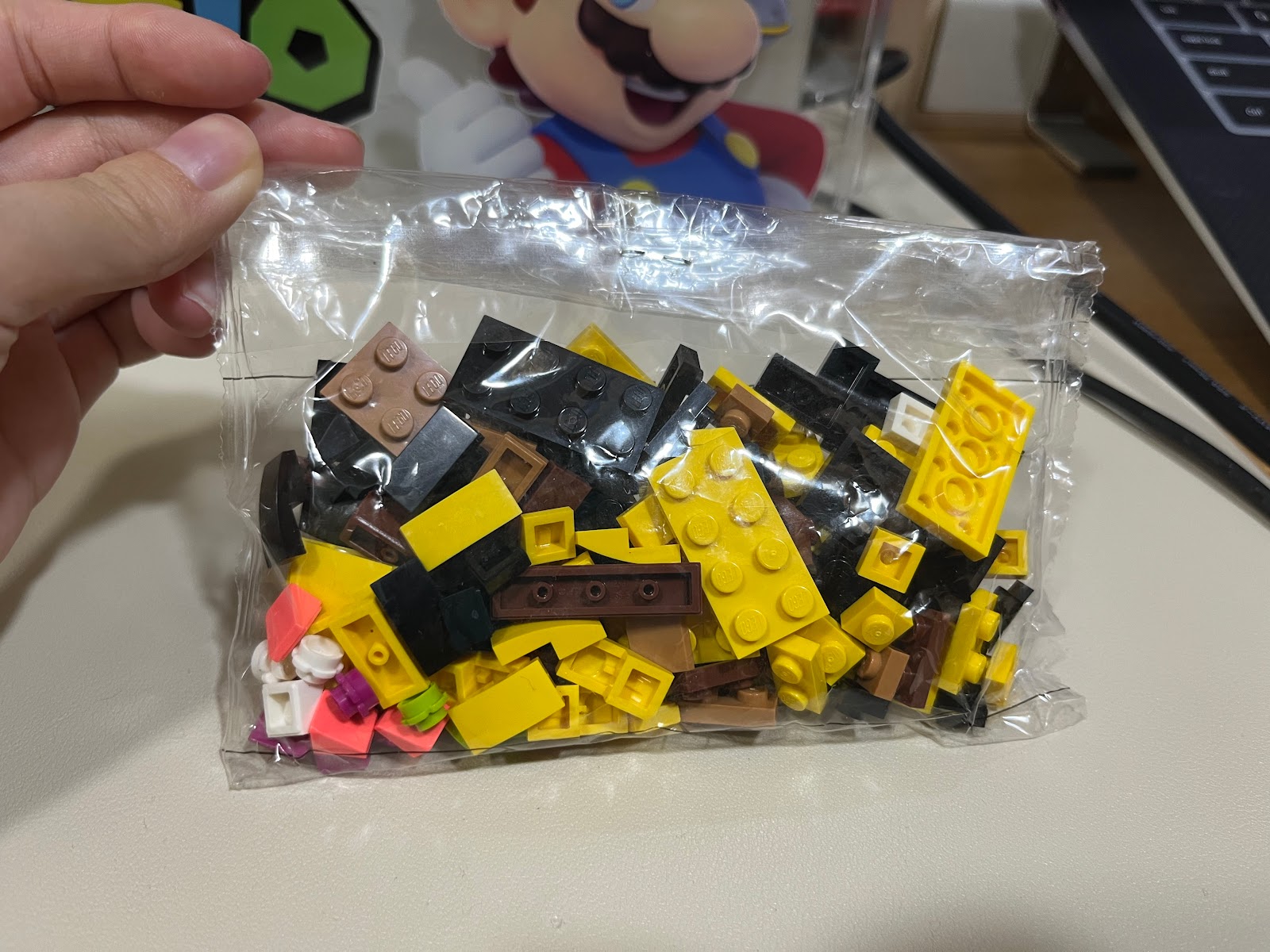 |
Figure 1.1 Object Chosen - Week 1 (6/2/2024)
|
Before the day of the class, I also created a very brief draft outlining how I intend to present my data. This will allow me to save more time during the class and kick-start the exercise efficiently.
 |
| Figure 1.2 Draft - Week 1 (6/2/2024) |
Mr. Shamsul suggested that we should find some references to gain ideas on how to analyze our data. I have found a few references that provide ideas on how to organize data based on colors and types.
 |
| Figure 1.3 Reference 1 - Week 1 (7/2/2024) |
 |
| Figure 1.4 Reference 2 - Week 1 (7/2/2024) |
 |
Figure 1.5 Reference 3 - Week 1 (7/2/2024)
|
Data Sorting and Arrangement
For my first attempt, I decided to sort the Lego pieces into categories such as plates and tiles, flowers and others. My plan was to organize the data based on the types of Lego pieces (such as 2x4, 2x2, 2x1, etc.) and then further categorize them by colors (brown, yellow, black, etc.).
 |
Figure 1.6 First Attempt - Week 1 (7/2/2024)
|
 |
| Figure 1.7 First Attempt Draft - Week 1 (7/2/2024) |
Then, Mr. Shamsul suggested that I explore other methods of sorting my Lego, such as by color. This sparked another idea for me to sort them based on colors first, followed by types.
 |
| Figure 1.8 Second Attempt - Week 1 (7/2/2024) |
 |
Figure 1.9 Second Attempt Draft - Week 1 (7/2/2024)
|
Final Outcome
 |
Figure 1.10 Final Outcome - Week 1 (7/2/2024)
|
 |
Figure 1.11 Final Outcome Zoomed - Week 1 (7/2/2024)
|
|
Exercise 2: L.A.T.C.H Infographic
In this exercise, we are tasked with creating a visual poster that organizes information using the L.A.T.C.H. principles. The L.A.T.C.H. principles stand for Location, Alphabet, Time, Category, and Hierarchy. We will be using a digital photo editing or illustration software to assemble the Pokémon into an infographic poster that incorporates these principles. You can reuse images of the monsters but you'll need to create the rest of the visuals to complete the poster. The final poster should have a size resolution of either 1240 × 1750 pixels or 2048 × 2048 pixels.
These are a few of the suggested compiled data we can use or, we can pick any topic we want:
- Pokedex
- FFXIV Bestiary
- Dinosaur
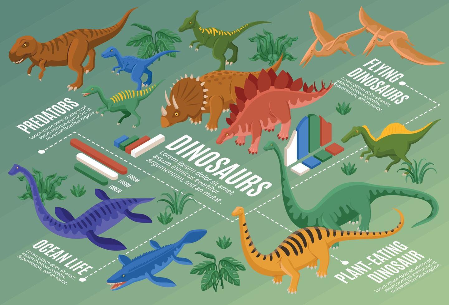
To begin, I've chosen dinosaurs as my data for the infographic poster. The original poster already presents information about dinosaur teeth. However, we're tasked with applying the L.A.T.C.H. principles to enhance it.
 |
| Figure 2.1 Chosen Topic (Dinosaur) - Week 2 (14/2/2024) |
1. Sketches
Upon reviewing the data, it focuses on categorizing dinosaur teeth based on their respective categories such as predator, omnivore, and herbivore. I have come out with various sketching sorting these data.
 |
| Figure 2.2.1 Sketch 1 - Week 2 (14/2/2024) |
My first sketches sorted the dinosaur names alphabetically, and the teeth were arranged from largest to smallest size. However, after showing them to Mr. Shamsul, he suggested including three or four sorting methods based on the L.A.T.C.H. principles.
 |
| Figure 2.2.2 Sketch 2 - Week 2 (14/2/2024) |
Another sketch I had organized the dinosaurs by location, then further broke them down into types of dinosaurs, and finally arranged them by the number of teeth from the most to the least.
 |
| Figure 2.2.3 Sketch 3 - Week 2 (14/2/2024) |
 |
| Figure 2.2.4 Sketch 4 - Week 2 (14/2/2024) |
The third and fourth sketches were similar in concept. They both categorized the dinosaurs by type first, followed by the sizes of their teeth. These teeth were further categorized into serrated and non-serrated, with sizes compared on both sides. It's akin to a comparison infographic. However, Mr. Shamsul preferred the second one over these two. He mentioned that the pyramid style in the third sketches is too common.
2. References
 |
| Figure 2.3.1 Reference 1 - Week 2 (14/2/2024) |
To get the idea for the poster, I found some visuals about dinosaurs. I like this references because they have an isometric view, and the data is presented on the floor.
 |
| Figure 2.3.2 Reference 2 - Week 2 (14/2/2024) |
This infographic shows the beaks and feet of different animals. I like how they are organized, with the feet on top and the beaks at the bottom. The overall look is very neat and easy to read. I also appreciate the simple beige background.
 |
| Figure 2.3.3 Reference 3 - Week 2 (14/2/2024) |
This poster has a minimal background, and I like how it organizes the animals. I also appreciate the graphics of the animals. Additionally, I noticed that the words are aligned with the shape of the animals.
3. Progress
 |
| Figure 2.4.1 Development 1 - Week 2 (14/2/2024) |
 |
Figure 2.4.2 Development 2 - Week 2 (14/2/2024)
|
Based on the sketches, I created a low-fidelity version of the poster to gain a clearer direction on how to organize the data. This helped me refine the layout and design elements before proceeding with the final version.
 |
Figure 2.4.3 Sketch Progress - Week 2 (14/2/2024)
|
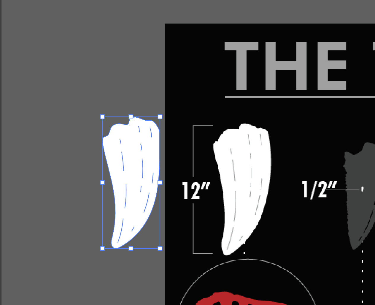 |
Figure 2.4.4 Teeth Tracing - Week 2 (15/2/2024)
|
I traced the teeth from the original poster and put them into the design. I also sourced dinosaur pictures online and removed their backgrounds. To enhance clarity, I included a legend indicating the colors representing each type of dinosaur (predator, omnivore, herbivore).
 |
| Figure 2.4.5 Poster Progression - Week 2 (16/2/2024) |
I chose a brown background to complement the theme of fossil soil. I used different shades of brown to differentiate between the types of dinosaurs. In this poster, I kept the font selection limited to only three typefaces to avoid clutter and maintain readability.
 |
| Figure 2.4.6 Fun Fact - Week 2 (16/2/2024) |
After arranging all the elements in their correct positions, I noticed a significant blank space on the right side. To utilize this space effectively, I added a sticky note containing a fun fact about the T-Rex's bite force. I also changed the background of the poster to resemble old paper, creating a retro feel that aligns with the dinosaur fossil theme.
 |
Figure 2.4.7 Illustrator Progress - Week 2 (16/2/2024)
|
 |
Figure 2.4.8 Final Designed Poster - Week 2 (16/2/2024)
|
After seeing my designed poster, Mr. Shamsul gave some feedback. I made some minor amendments according to his feedback. I changed the color of the backgrounds behind the types of dinosaurs and also moved the index down to the bottom.
Final Outcome
 |
Figure 2.5.1 Final Designed Poster - Week 3 (21/2/2024)
|
|
Figure 2.5.2 Final Designed Poster (PDF) - Week 3 (21/2/2024)
FEEDBACK
Week 3 (Exercise 2)
Change the color for the dinosaur type. Use red for predators, as red represents fierceness, etc. Move the index to somewhere at the bottom.
Week 2 (Exercise 2)
The first sketch lacks sufficient information. You will need to include three or four sorting methods based on the L.A.T.C.H. principles. Let's choose the fourth sketch; it looks interesting. However, you will need to design it nicely.
Week 1 (Exercise 1)
You can find some references and mimic their way of sorting data. As a designer, you should think and be more creative than non-designers.
REFLECTION
Experience
Exercise 1 was quite a fun experience for me. I personally enjoyed sorting items and organizing them. It has also taught me to consider different aspects. Quantifying data also helps viewers understand better, often at first glance. Exercise 2 was my first attempt at designing an infographic poster. It was challenging for me to organize the information in a visually appealing yet informative manner. I found myself struggling to strike the right balance between aesthetics and data organization. However, sketching proved to be immensely helpful during this process. Overall, despite the challenges, I thoroughly enjoyed designing a poster about dinosaurs.
Observation
I observed that by doing data sorting exercises, it enhance my problem solving skills. The process of sorting data has required me to think critically and find creative solutions to categorize and arrange the information.
Findings
Overall, I find that this exercise has been extremely beneficial. By quantifying and organizing the data, I have learned how to present information in a clear and concise manner, making it easier for others to understand. Also, when creating comparison infographics, I realized the importance of aligning items and color schemes to enhance the aesthetic appeal of the design.


Comments
Post a Comment