Digital Photography & Imaging - Project 1

Ting Wen Yi / 0361799 / Group 3
Digital Photography & Imaging / Bachelor of Design (Hons) in Creative Media
Project 1A & 1B
INSTRCTIONS
Project 1A Task 1 - Physical Collage Design
- Select and distinguish the design elements that you want to use in your collage, and create a unique concept or narrative by combining them.
- Prior to creating your collage, arrange the design elements in a rough composition to see how they fit together.
Project 1A Task 2 - Digital Collage Design
- Download all of the images here to your computer: https://drive.google.com/drive/folders/1cGcbENrjSksAaMQK9np2jb6ZaM7Y-81l?usp=sharing
- Follow this tutorial demo as reference to create your digital collage: https://youtu.be/BlW7F-fTsbE
- Create 3 different composition digital collages from the images that you’ve downloaded.
- Create A4 canvas size (vertical) on Photoshop and start to do the compositions.
- Take 3 photo of your digital collage compositions and insert it on the section below
- Submit (Turn In) this file on Google Classroom
Project 1B: Exercise 1 (Photo Manipulation)
Part 1: SHAZAM
Follow this quick tutorial to understand how to use:
- Quick Selection Tool
- Layer Mask
- Filters
- Color Correction
Tutorial : https://docs.google.com/presentation/d/1Uc5UY-PjqTCImigtHk8qh6vUuutTZw8qAjJHiNXjPOM/edit#slide=id.p2
Part 2
Based on SHAZAM exercise, create the same steps and insert your own photo to replace the SHAZAM’s layer by following these steps:
- Take a photo of yourself using the right lighting techniques
- Apply the Shazam’s exercise techniques
- Replace the Shazam’s layer with YOUR OWN PHOTO
- Apply suitable Color Correction to finalize your work
Project 1B: Exercise 2 (Recoloring)
Part 1: Turn B&W photo into COLOUR photo
Part 2: Recoloring B&W photo- Advanced level
PROJECT IA: (PHYSICAL & DIGITAL)
1. Physical Collage
Gathering of Materials
 |
| Figure 1.1 Materials - Week 1 (6/4/2023) |
The materials I used for my collage include scrap papers, a red plastic sheet, a magazine, newspapers (which I used to cut out words since the magazine was in Chinese), and a chipboard as the base. My theme and direction are towards animals.
Cutting out
 |
| Figure 1.2 Cutouts - Week 1 (6/4/2023) |
I used a pen knife and scissors to cut out the pictures for my collage. These are some of the papers I cut out. Once I finished cutting them, I started my first composition.
Pre-Composition 1
 |
| Figure 1.3 First Composition - Week 1 (6/4/2023) |
Pre-Composition 2
 |
| Figure 1.4 Second Composition - Week 1 (6/4/2023) |
After reviewing my first pre-composition, I decided to add more color and texture to the collage. I experimented with the placement of the elements and added different types of materials to better convey my message of animal awareness. To give the composition more visual interest, I added a yellow frame to complement the frog element. Additionally, to provide some contrast, I included red dots in the design. To further reinforce my message, I also included the words "world end" in the collage to raise awareness about the urgent need to protect and preserve our planet's biodiversity. Despite these changes, I still felt that the design lacked something.
Pre-Composition 3
 |
| Figure 1.5 Third Composition - Week 1 (6/4/2023) |
This is my favorite pre-composition. To address the problems in second composition, I considered adding more elements to the composition, or experimenting with different arrangements. I could try to incorporate additional visual elements, such as textures or patterns, to enhance the overall look and feel of the collage. I removed the dinosaur because I wanted to focus on living animals, rather than extinct ones. Instead, I replaced the fish with a black whale to create better visual balance. Additionally, I added a plant to incorporate more greenery and make the composition more visually appealing. To reinforce my message of raising awareness for animal conservation, I added more words like "how much more time they have" to connect with my concept. I also added giraffe stripes to create a scrapbook or journal-like effect, to make it look like washi tape. Overall, I am satisfied with this composition before receiving feedback from my lecturer. I believe the changes I made have helped to better convey my message of animal awareness through a more balanced and visually appealing composition.
Pre-Composition 4
 |
| Figure 1.6 Fourth Composition - Week 2 (13/4/2023) |
Final Physical Collage
 |
| Figure 1.7 Final Physical Collage "The Clock is Ticking" - Week 2 (13/4/2023) |
Concept
My collage aims to raise awareness about animals. The top phrase "how much more time they have" is written from the perspective of animals, evoking feelings of fear and the need for help. The theme of the collage is centered on animals, with a picture of a watch symbolizing the limited time they have in their natural habitats. To create contrast, I added red dots to the yellow frame. The background is made up of scrap paper to add more visuals. Additionally, I included QR codes to enhance the overall look of the collage.
Second Physical Collage
 |
| Figure 1.8 Second Collage |
I created a second collage just for fun. I cut out some pictures and words from an unused magazine.
2. Digital Collage
Composition 1
 |
| Figure 2.1 Digital Collage Composition 1 - Week 3 (21/4/2023) |
 |
| Figure 2.2 Digital Collage 1 Elements - Week 3 (21/4/2023) |
For my first composition, I employed the rule of thirds. My concept is "write your own story." The main focus of the composition is a typewriter, which serves as a symbol of the act of writing. Above the typewriter, I placed a circular texture to represent the earth, with two identical buildings arranged side by side to create the illusion of a round shape. In the center of the composition, I added a boy to create a sense of balance and add a dynamic element to the image. Additionally, I included fish and plants in the composition to create a sense of natural beauty.
Composition 2
 |
| Figure 2.3 Digital Collage Composition 2 - Week 3 (21/4/2023) |
 |
| Figure 2.4 Digital Collage 2 Elements - Week 3 (21/4/2023) |
For my second collage, I once again used a typewriter as one of the main focus of the composition. This time, I added two tiny figures of old people standing on top of the typewriter. On top of the typewriter, I added a building to create more layers and depth in the image. To make the image more visually interesting, I edited the lift at the side of the building to make it appear as though fish were coming out of it. I placed three fish on top of the collage to create a triangular shape that adds balance to the image. I added two plants to add a touch of green to the overall color scheme. For the background of the composition, I used a variety of different texture pictures, some of the pictures I inverted the color to add variety. I was looking for geometric shapes to create a more structured background, so I used square boxes to fill up the space. I would name this concept as "The Grand Storytellers".
 |
| Figure 2.5 Digital Collage 2 Edited - Week 4 (27/4/2023) |
.png) |
| Figure 2.6 Tone Adjustments - Week 4 (27/4/2023) |
I learned that photo filters can increase the difference between the lightest and darkest areas of a photo, making it look more vivid and dynamic. In this case, my background was bright and messy, and that color took away from my main focal point. Therefore, I used photo filters and saturation to dim down the background, so that my focal point pops out.
Composition 3
 |
| Figure 2.7 Digital Collage Composition 3 - Week 3 (21/4/2023) |
|

Composition 4
 |
| Figure 2.9 Digital Collage Composition 4 - Week 3 (21/4/2023) |
 |
| Figure 2.10 Digital Collage 4 Elements - Week 3 (21/4/2023) |
For my fourth composition, I utilized the golden ratio in my collage to create a visual representation of a world dominated by fish. The central focus of the composition is on the fish themselves, highlighting their importance and drawing attention to the beauty of their surroundings. The composition is meant to serve as a reminder of the importance of nature and the need to appreciate the world around us, especially in a time when people are increasingly focused on technology and the built environment. To add to the effect, I added plants on top of a building, creating a contrast between the natural world and the urban environment. I also incorporated a signboard from a subway and a subway train to add a sense of movement and dynamism to the image. I used a wavy liquid as a background, inverting it to black to create a contrast with the white background.
Final Physical Collage
 |
| Figure 2.11 Final Digital Collage "The Grand Storyteller" - Week 4 (27/4/2023) |
PROJECT 1B : HEARST MANSION & RECOLORING B&W
1. Photo Manipulation
Part 1: Hearst Mansion and Shazam Digital Collage
Figure 3.1 Hearst Mansion Digital Collage Tutorial
For the first part, we need to do a follow along digital collage with the mansion and Shazam.
 |
| Figure 3.2 Hearst Mansion |
 Figure 3.3 Shazam |
 |
| Figure 3.4 Final Hearst Mansion and Shazam Digital Collage - Week 6 (11/5/2023) |
Part 2: "My Reflection" Digital Collage

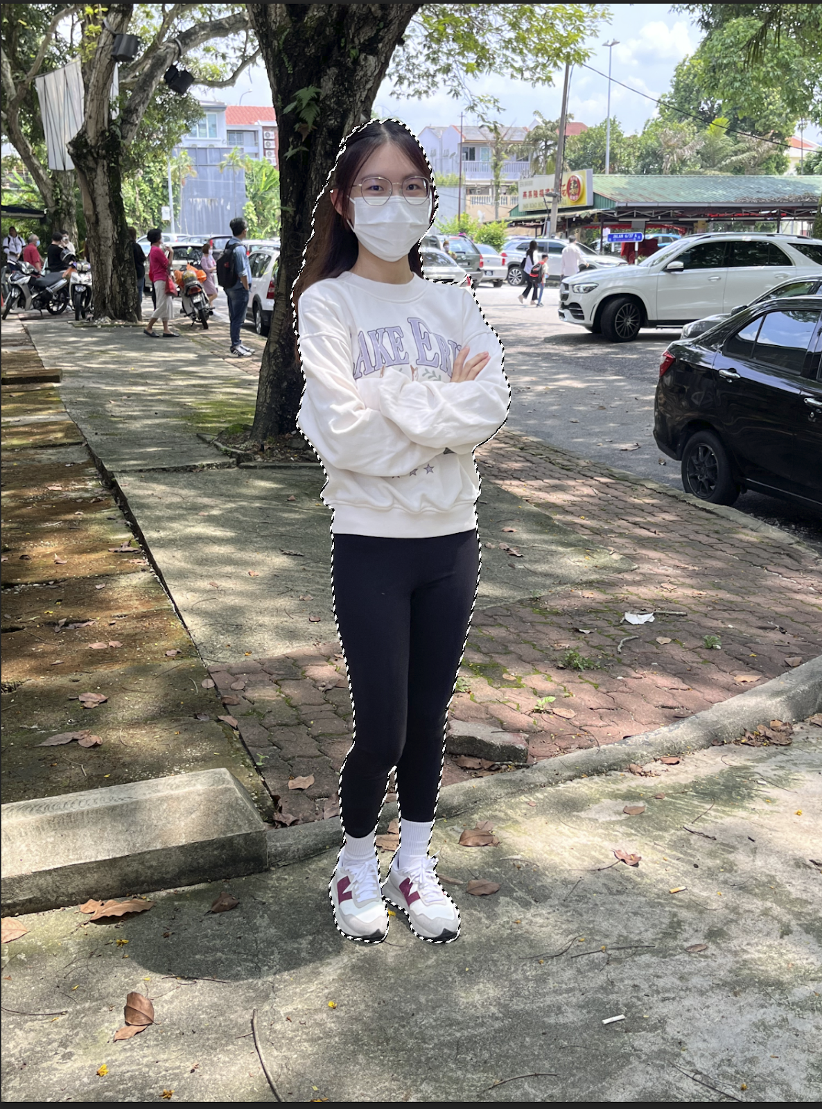
Figure 3.5 & 3.6 Full-body Self-portrait and Masking - Week 6 (11/5/2023)
Our task for Part 2 was to take a full-body self-portrait from eye level and edit it into the Hearst Mansion photo using the same steps we used for the Shazam collage. I took my picture outdoors to get better and more natural lighting.
 | |||
Figure 3.7 Final "My Reflection" Digital Collage - Week 6 (11/5/2023)2. Recoloring Black & WhitePart 1: Recolouring with Brush Tool Figure 4.1 Recoloring Black & White Tutorial In the second task, our task involves applying color to a black and white image by following a tutorial available on YouTube.  Figure 4.2 Black & White Portrait   Figure 4.3 & 4.4 Recoloring Progress and Final Recolored photo - Week 7 (19/5/2023) Part 2: Recoloring with layer masks (Advanced Recoloring) Figure 4.5 Recoloring Black & White Tutorial In the second part of Exercise 2, our objective is to follow along with a demonstration that showcases advanced recoloring techniques.    Figure 4.6 & 4.7 & 4.8 Black & white portrait along with hair and skin color reference images
 Upon finishing the demo image, our next step entails selecting a black and white image from the provided Google Drive. I have opted for a portrait of Harry Styles. |


FINAL WORK
 |
| Figure 5.1 Final Physical Collage "The Clock is Ticking" - Week 2 (13/4/2023) |
 | ||||
Figure 5.2 Final Digital Collage "The Grand Storyteller" - Week 4 (27/4/2023)
 Figure 5.5 Final Recolored Photo - Week 7 (19/5/2023)   |
FEEDBACK
Week 2: Mr. Mohd Fauzi commented on pre-composition 4, stating that he is fine with the design. He mentioned that there are two big elements, and if it's only one is better, having two focal points in art is also acceptable.
Week 4: Proceed with Composition 1 or 2 for the final. Composition 2 has a good background texture, but need to add filters to make the background less vivid and make the focal point stand out more.
REFLECTIONS
Experience
My experience with creating a physical collage was quite fun and interesting. Different elements and compositions can result in another style. It was fun to juggle around the pictures to find the ones that looked best to my liking. The physicality of the process, from cutting out the images to arranging and gluing them, was a therapeutic and enjoyable experience. It also trained my patience as I needed to cut some small edges. As I shift to digital collage, I find it easier to cut out pictures, especially those with smaller edges. The magic wand tool is also very useful, especially for images with white backgrounds like fishes. With this tool, you can simply click on the outer area and invert the selection to copy the image. However, I find the second exercise daunting because I don't know where to start or how to create a nice collage with such limited elements. I struggle with this because I'm a perfectionist and tend to find imperfections. I want to create something the best I can and spend a lot of time making movements before every composition. I also want each composition to carry its own story. In project 1B, I acquired knowledge about two methods for recoloring black and white photographs: utilizing a photo reference and employing Photoshop. This newfound knowledge has proven to be particularly valuable, especially when attempting to recolor old photographs. These techniques provide effective means to restore life and vibrancy to faded or monochromatic images, allowing us to recreate the original colors and enhance the visual appeal of vintage photographs.
Observation
I observed that when images overlapped, they created interesting visual textures, while the words added depth and meaning to the piece. As I stepped back to admire my finished creation, I felt a surge of joy and pride. It was a unique and personal artwork that captured my mood and emotions in that moment. I also observed that different compositions and styles can bring out completely different stories. I have discovered that recoloring a black and white photo is not as difficult as it may seem. It simply requires attention to detail, a patient approach, and adherence to the provided guidelines.
Findings
Throughout the exercise, I discovered that collages don't have many rules because different people have different aesthetics. However, there are tips that can help, such as not using wet glue because it can ruin the texture of the paper. I also think that a collage can have different sizes of elements - big, medium, and small, because they can balance each other out. The big element serves as the focal point of the whole collage, while the medium and small elements add visual interest and harmony. It's fascinating to see how different sizes of elements can interact and create a sense of composition in the collage. After the lecturer introduced the golden ratio and the rule of thirds, I realized that they can help me create balance, harmony, and visual interest in my collages. I also learned how to use different lasso tools and the pen tool to cut out pictures.


Comments
Post a Comment